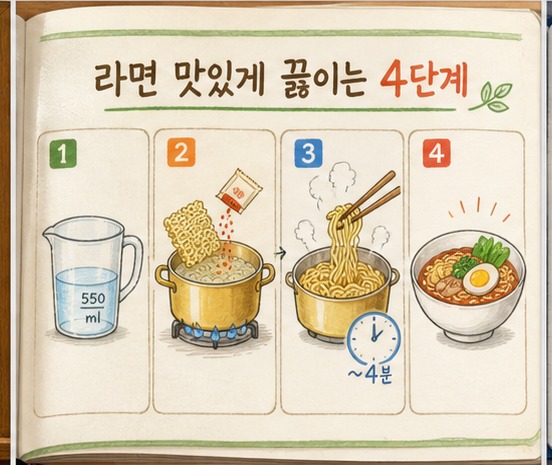
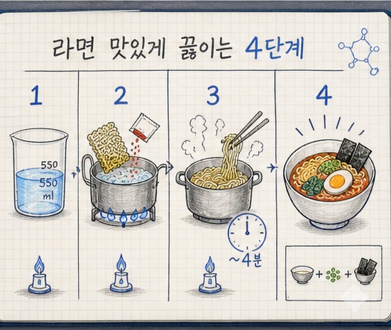
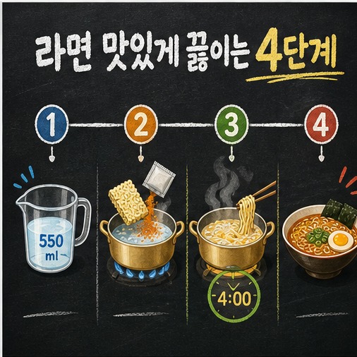
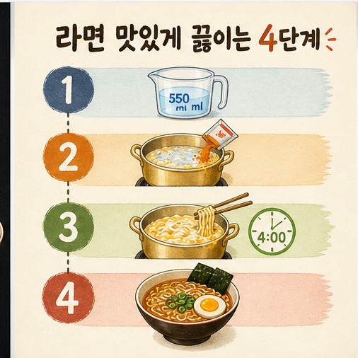
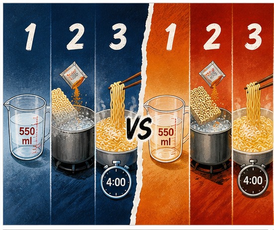
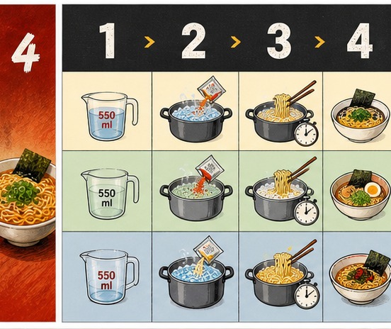
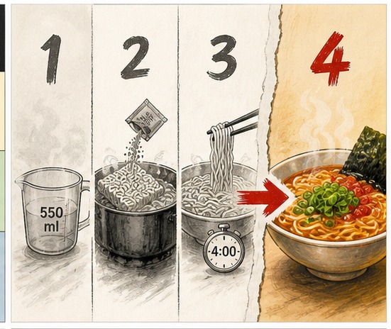
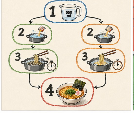
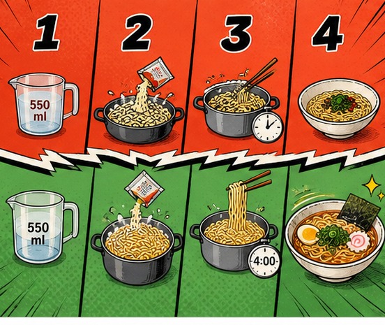
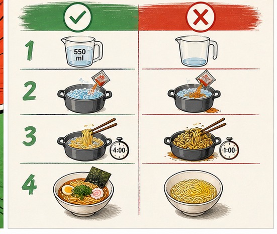
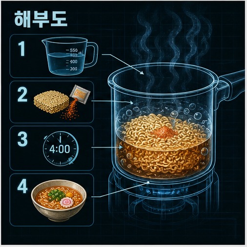
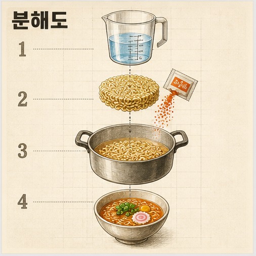
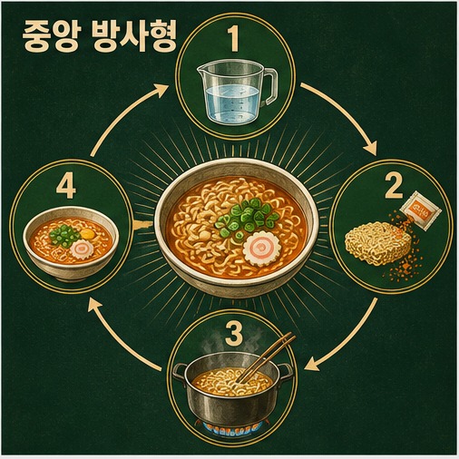
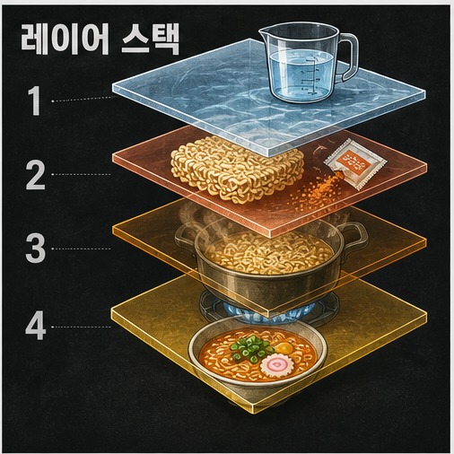
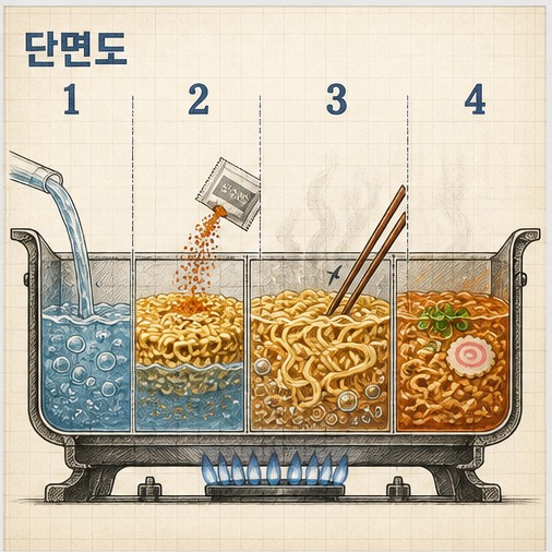
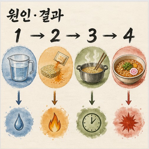
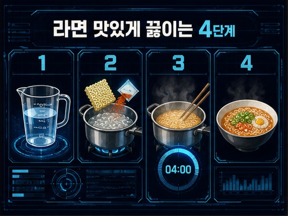
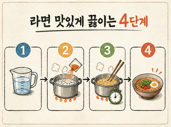
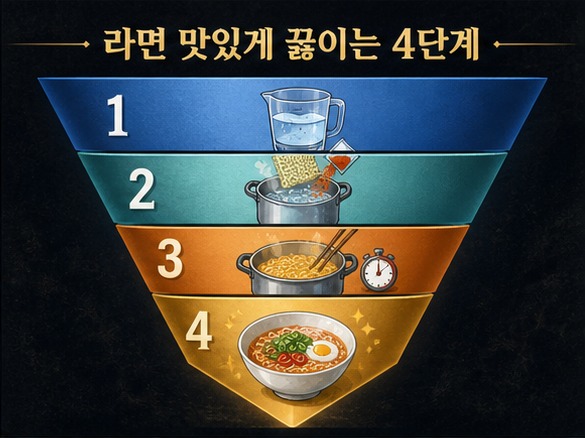
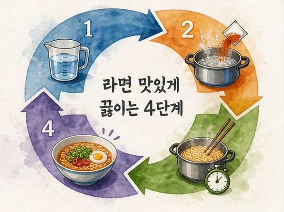
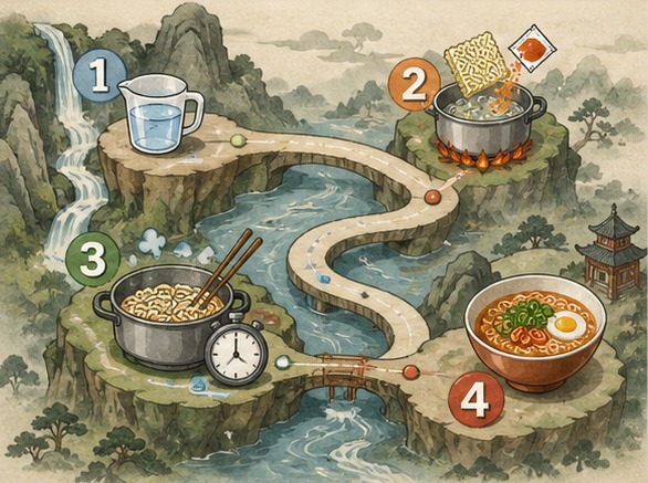
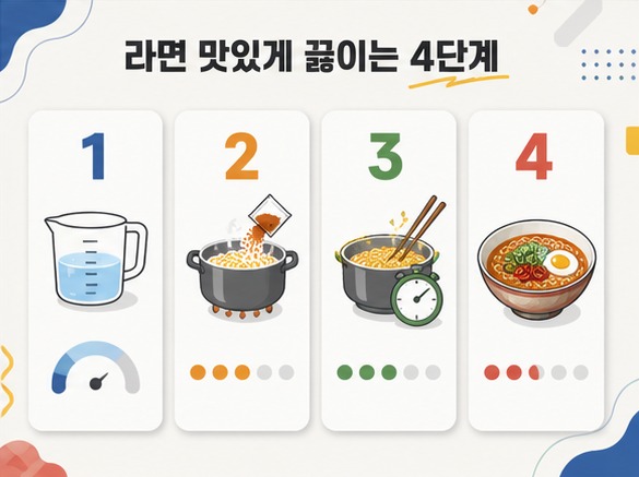
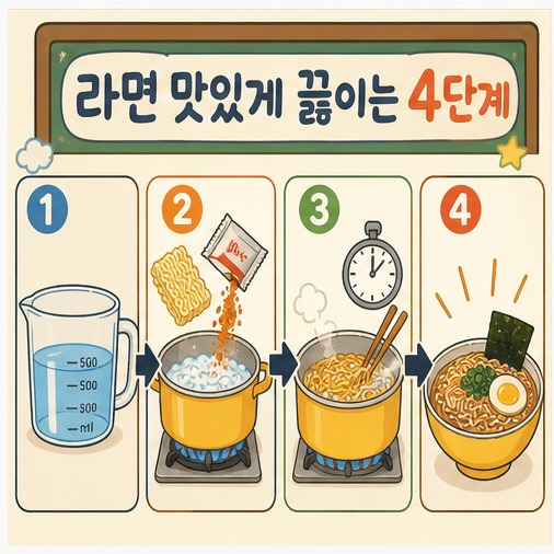
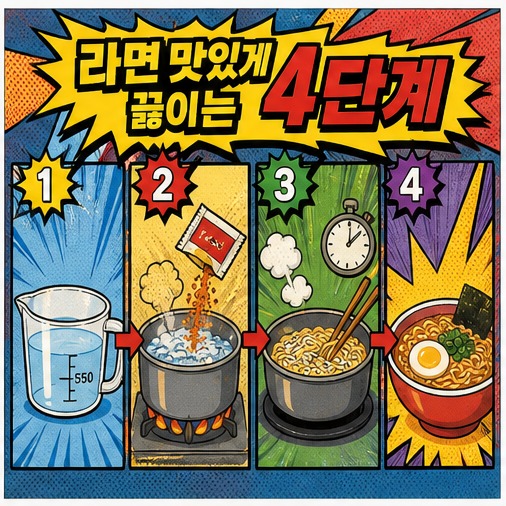
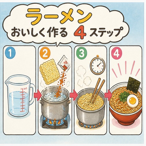
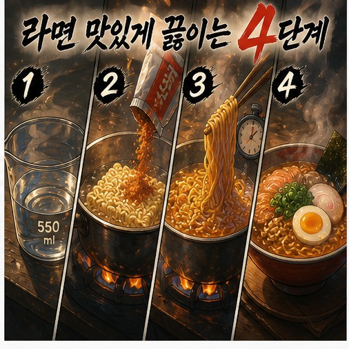
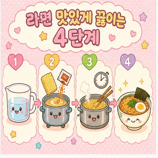
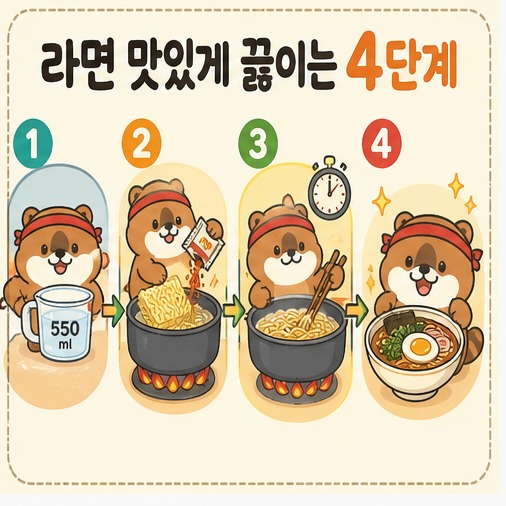
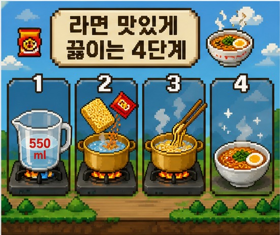
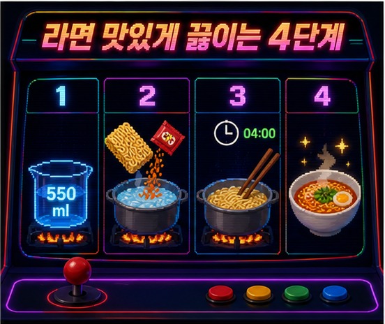
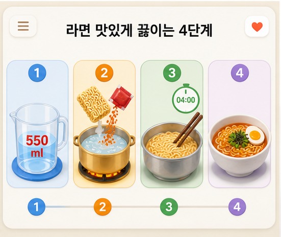
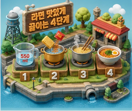
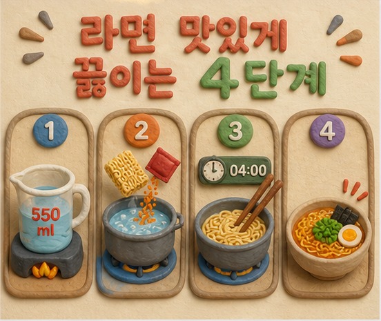
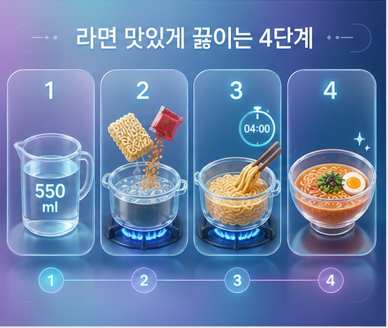
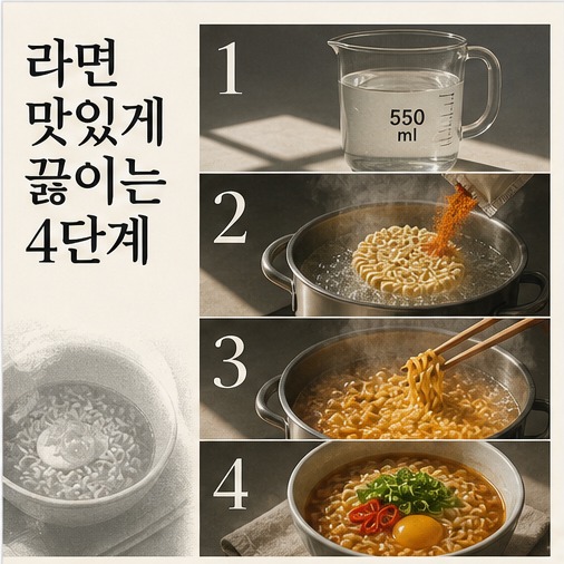
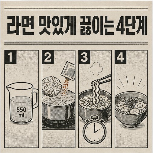
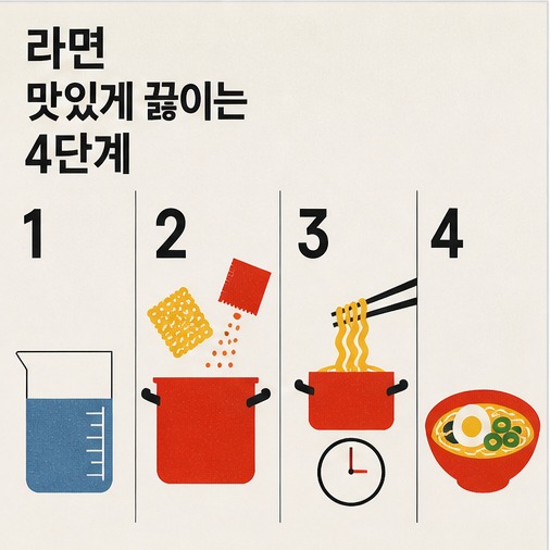
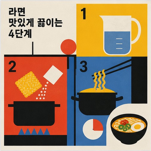
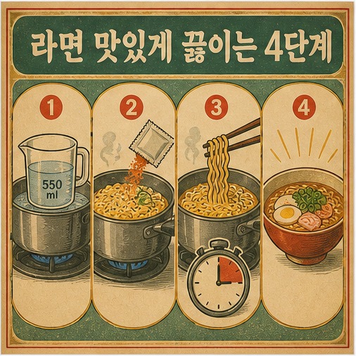
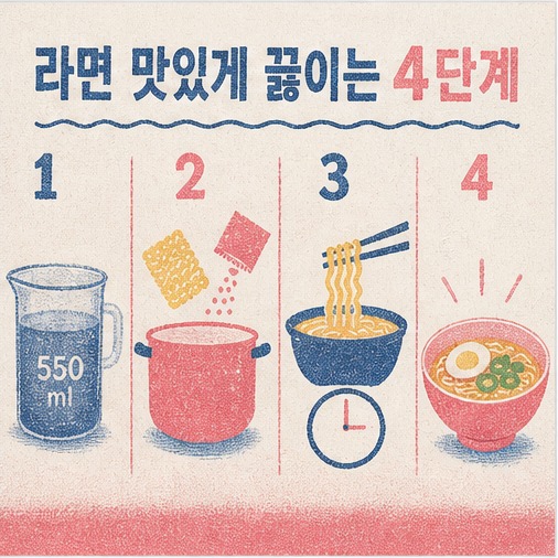
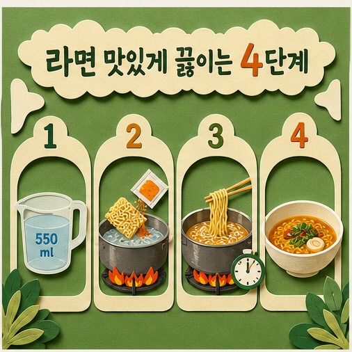
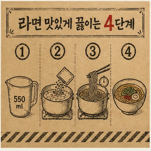
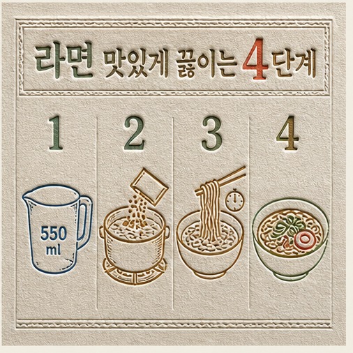
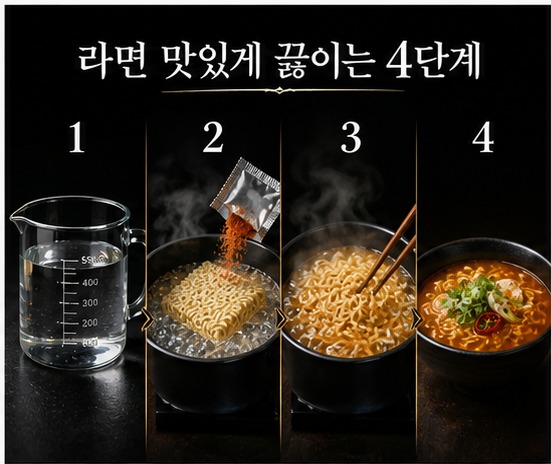
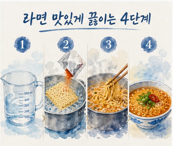
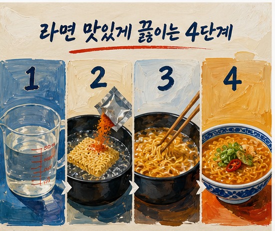
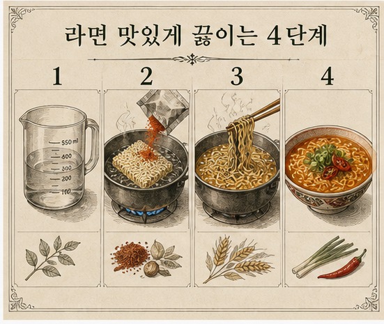
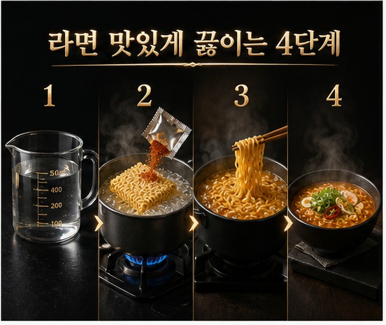
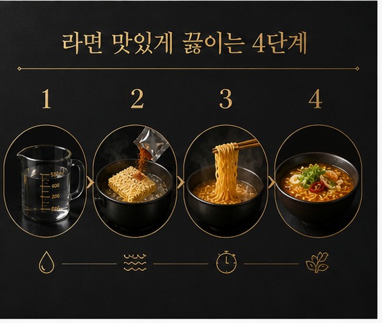
AI 이미지 생성 도구에서 그대로 쓸 수 있는 인포그래픽 프롬프트 60개입니다. 손그림 학습형부터 리얼·아트형까지 10개 카테고리, 스타일마다 예시 이미지와 한글·영문 프롬프트를 실었습니다.
AI 이미지 생성 도구에서 아래 프롬프트를 그대로 붙여넣어 사용합니다. 예시 이미지는 전부 "라면 맛있게 끓이는 방법"으로 통일했습니다.
10개 카테고리, 스타일 60개 — 카테고리당 6개씩입니다.
1. 손그림 학습형
스프링 노트 · 스케치노트 · 화이트보드 · 칠판 분필 · 교과서 삽화 · 과학자 연구 노트
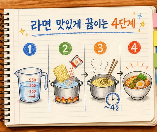
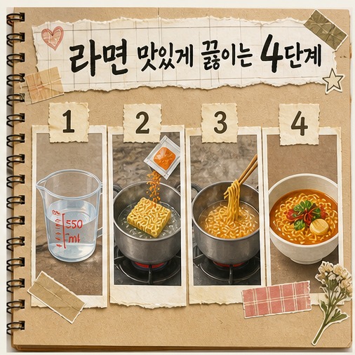
1. 스프링 노트
추천 용도 교육 설명, 핵심 요약
시각 문법 아이보리 종이, 상단 링, 손그림 선, 형광펜 제목
제공된 소스를 분석하여 하나의 완결된 인포그래픽으로 구성해줘. 전체 내용을 스프링 노트 스타일로 표현하고, 아이보리 종이, 상단 링, 손그림 선, 형광펜 제목을 핵심 시각 문법으로 사용해. 중앙 또는 첫 구역에 명확한 제목을 배치하고, 핵심 정보를 4~6개 구역으로 나눠 번호·아이콘·화살표·연결선으로 읽는 순서를 보여줘. 각 구역은 짧은 제목과 1~2문장의 설명만 사용하며, 중요한 수치와 결론은 크게 강조해. 장식보다 정보 관계와 한글 가독성을 우선하고, 제공된 소스에 없는 사실은 추가하지 마. 로고와 워터마크 없이 16:9 가로 화면으로 제작해.
Analyze the provided sources and turn them into one self-contained infographic in a 스프링 노트 visual style. Use 아이보리 종이, 상단 링, 손그림 선, 형광펜 제목 as the core visual language. Place a clear title in the center or opening section, divide the content into four to six information zones, and show the reading order with numbers, icons, arrows, and connector lines. Give each zone a short heading and only one or two concise sentences. Enlarge key figures and conclusions. Prioritize information relationships and legibility over decoration, add no facts unsupported by the sources, and create a 16:9 landscape composition with no logos or watermarks.
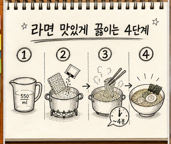
2. 스케치노트
추천 용도 교육 설명, 핵심 요약
시각 문법 낙서 아이콘, 점선 화살표, 손글씨, 여백
제공된 소스를 분석하여 하나의 완결된 인포그래픽으로 구성해줘. 전체 내용을 스케치노트 스타일로 표현하고, 낙서 아이콘, 점선 화살표, 손글씨, 여백을 핵심 시각 문법으로 사용해. 중앙 또는 첫 구역에 명확한 제목을 배치하고, 핵심 정보를 4~6개 구역으로 나눠 번호·아이콘·화살표·연결선으로 읽는 순서를 보여줘. 각 구역은 짧은 제목과 1~2문장의 설명만 사용하며, 중요한 수치와 결론은 크게 강조해. 장식보다 정보 관계와 한글 가독성을 우선하고, 제공된 소스에 없는 사실은 추가하지 마. 로고와 워터마크 없이 16:9 가로 화면으로 제작해.
Analyze the provided sources and turn them into one self-contained infographic in a 스케치노트 visual style. Use 낙서 아이콘, 점선 화살표, 손글씨, 여백 as the core visual language. Place a clear title in the center or opening section, divide the content into four to six information zones, and show the reading order with numbers, icons, arrows, and connector lines. Give each zone a short heading and only one or two concise sentences. Enlarge key figures and conclusions. Prioritize information relationships and legibility over decoration, add no facts unsupported by the sources, and create a 16:9 landscape composition with no logos or watermarks.
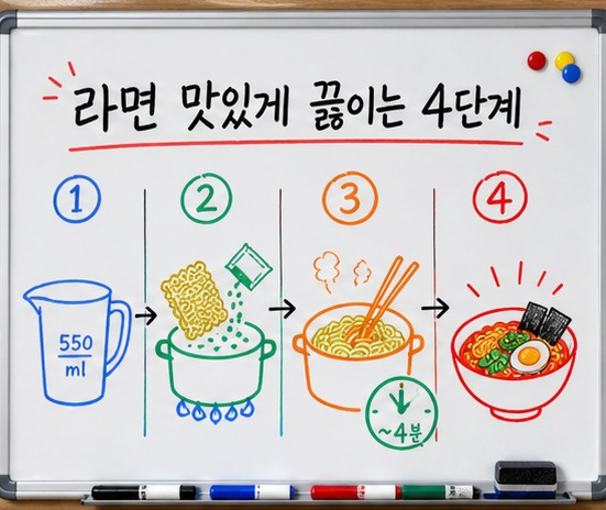
3. 화이트보드
추천 용도 교육 설명, 핵심 요약
시각 문법 흰 보드, 컬러 마커, 둥근 구획, 간결한 아이콘
제공된 소스를 분석하여 하나의 완결된 인포그래픽으로 구성해줘. 전체 내용을 화이트보드 스타일로 표현하고, 흰 보드, 컬러 마커, 둥근 구획, 간결한 아이콘을 핵심 시각 문법으로 사용해. 중앙 또는 첫 구역에 명확한 제목을 배치하고, 핵심 정보를 4~6개 구역으로 나눠 번호·아이콘·화살표·연결선으로 읽는 순서를 보여줘. 각 구역은 짧은 제목과 1~2문장의 설명만 사용하며, 중요한 수치와 결론은 크게 강조해. 장식보다 정보 관계와 한글 가독성을 우선하고, 제공된 소스에 없는 사실은 추가하지 마. 로고와 워터마크 없이 16:9 가로 화면으로 제작해.
Analyze the provided sources and turn them into one self-contained infographic in a 화이트보드 visual style. Use 흰 보드, 컬러 마커, 둥근 구획, 간결한 아이콘 as the core visual language. Place a clear title in the center or opening section, divide the content into four to six information zones, and show the reading order with numbers, icons, arrows, and connector lines. Give each zone a short heading and only one or two concise sentences. Enlarge key figures and conclusions. Prioritize information relationships and legibility over decoration, add no facts unsupported by the sources, and create a 16:9 landscape composition with no logos or watermarks.
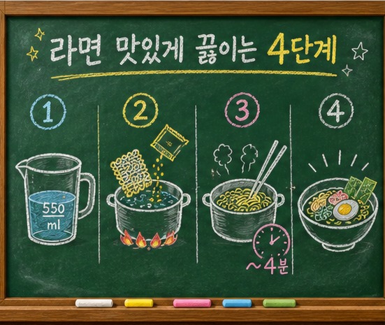
4. 칠판 분필
추천 용도 교육 설명, 핵심 요약
시각 문법 검은 칠판, 분필 선, 컬러 초크, 가루 질감
제공된 소스를 분석하여 하나의 완결된 인포그래픽으로 구성해줘. 전체 내용을 칠판 분필 스타일로 표현하고, 검은 칠판, 분필 선, 컬러 초크, 가루 질감을 핵심 시각 문법으로 사용해. 중앙 또는 첫 구역에 명확한 제목을 배치하고, 핵심 정보를 4~6개 구역으로 나눠 번호·아이콘·화살표·연결선으로 읽는 순서를 보여줘. 각 구역은 짧은 제목과 1~2문장의 설명만 사용하며, 중요한 수치와 결론은 크게 강조해. 장식보다 정보 관계와 한글 가독성을 우선하고, 제공된 소스에 없는 사실은 추가하지 마. 로고와 워터마크 없이 16:9 가로 화면으로 제작해.
Analyze the provided sources and turn them into one self-contained infographic in a 칠판 분필 visual style. Use 검은 칠판, 분필 선, 컬러 초크, 가루 질감 as the core visual language. Place a clear title in the center or opening section, divide the content into four to six information zones, and show the reading order with numbers, icons, arrows, and connector lines. Give each zone a short heading and only one or two concise sentences. Enlarge key figures and conclusions. Prioritize information relationships and legibility over decoration, add no facts unsupported by the sources, and create a 16:9 landscape composition with no logos or watermarks.
5. 교과서 삽화
추천 용도 교육 설명, 핵심 요약
시각 문법 정돈된 단원 제목, 단면 삽화, 설명 라벨
제공된 소스를 분석하여 하나의 완결된 인포그래픽으로 구성해줘. 전체 내용을 교과서 삽화 스타일로 표현하고, 정돈된 단원 제목, 단면 삽화, 설명 라벨을 핵심 시각 문법으로 사용해. 중앙 또는 첫 구역에 명확한 제목을 배치하고, 핵심 정보를 4~6개 구역으로 나눠 번호·아이콘·화살표·연결선으로 읽는 순서를 보여줘. 각 구역은 짧은 제목과 1~2문장의 설명만 사용하며, 중요한 수치와 결론은 크게 강조해. 장식보다 정보 관계와 한글 가독성을 우선하고, 제공된 소스에 없는 사실은 추가하지 마. 로고와 워터마크 없이 16:9 가로 화면으로 제작해.
Analyze the provided sources and turn them into one self-contained infographic in a 교과서 삽화 visual style. Use 정돈된 단원 제목, 단면 삽화, 설명 라벨 as the core visual language. Place a clear title in the center or opening section, divide the content into four to six information zones, and show the reading order with numbers, icons, arrows, and connector lines. Give each zone a short heading and only one or two concise sentences. Enlarge key figures and conclusions. Prioritize information relationships and legibility over decoration, add no facts unsupported by the sources, and create a 16:9 landscape composition with no logos or watermarks.
6. 과학자 연구 노트
추천 용도 교육 설명, 핵심 요약
시각 문법 격자 종이, 관찰 메모, 측정값, 작은 도해
제공된 소스를 분석하여 하나의 완결된 인포그래픽으로 구성해줘. 전체 내용을 과학자 연구 노트 스타일로 표현하고, 격자 종이, 관찰 메모, 측정값, 작은 도해을 핵심 시각 문법으로 사용해. 중앙 또는 첫 구역에 명확한 제목을 배치하고, 핵심 정보를 4~6개 구역으로 나눠 번호·아이콘·화살표·연결선으로 읽는 순서를 보여줘. 각 구역은 짧은 제목과 1~2문장의 설명만 사용하며, 중요한 수치와 결론은 크게 강조해. 장식보다 정보 관계와 한글 가독성을 우선하고, 제공된 소스에 없는 사실은 추가하지 마. 로고와 워터마크 없이 16:9 가로 화면으로 제작해.
Analyze the provided sources and turn them into one self-contained infographic in a 과학자 연구 노트 visual style. Use 격자 종이, 관찰 메모, 측정값, 작은 도해 as the core visual language. Place a clear title in the center or opening section, divide the content into four to six information zones, and show the reading order with numbers, icons, arrows, and connector lines. Give each zone a short heading and only one or two concise sentences. Enlarge key figures and conclusions. Prioritize information relationships and legibility over decoration, add no facts unsupported by the sources, and create a 16:9 landscape composition with no logos or watermarks.
2. 순서·과정형
가로 타임라인 · 세로 스텝 · 로드맵 · 컨베이어 벨트 · 레시피 카드 · 체크리스트
7. 가로 타임라인
추천 용도 절차 안내, 사용법
시각 문법 왼쪽에서 오른쪽으로 이어지는 4단계와 큰 번호
제공된 소스를 분석하여 하나의 완결된 인포그래픽으로 구성해줘. 전체 내용을 가로 타임라인 스타일로 표현하고, 왼쪽에서 오른쪽으로 이어지는 4단계와 큰 번호을 핵심 시각 문법으로 사용해. 중앙 또는 첫 구역에 명확한 제목을 배치하고, 핵심 정보를 4~6개 구역으로 나눠 번호·아이콘·화살표·연결선으로 읽는 순서를 보여줘. 각 구역은 짧은 제목과 1~2문장의 설명만 사용하며, 중요한 수치와 결론은 크게 강조해. 장식보다 정보 관계와 한글 가독성을 우선하고, 제공된 소스에 없는 사실은 추가하지 마. 로고와 워터마크 없이 16:9 가로 화면으로 제작해.
Analyze the provided sources and turn them into one self-contained infographic in a 가로 타임라인 visual style. Use 왼쪽에서 오른쪽으로 이어지는 4단계와 큰 번호 as the core visual language. Place a clear title in the center or opening section, divide the content into four to six information zones, and show the reading order with numbers, icons, arrows, and connector lines. Give each zone a short heading and only one or two concise sentences. Enlarge key figures and conclusions. Prioritize information relationships and legibility over decoration, add no facts unsupported by the sources, and create a 16:9 landscape composition with no logos or watermarks.
8. 세로 스텝
추천 용도 절차 안내, 사용법
시각 문법 위에서 아래로 흐르는 카드와 연결 화살표
제공된 소스를 분석하여 하나의 완결된 인포그래픽으로 구성해줘. 전체 내용을 세로 스텝 스타일로 표현하고, 위에서 아래로 흐르는 카드와 연결 화살표을 핵심 시각 문법으로 사용해. 중앙 또는 첫 구역에 명확한 제목을 배치하고, 핵심 정보를 4~6개 구역으로 나눠 번호·아이콘·화살표·연결선으로 읽는 순서를 보여줘. 각 구역은 짧은 제목과 1~2문장의 설명만 사용하며, 중요한 수치와 결론은 크게 강조해. 장식보다 정보 관계와 한글 가독성을 우선하고, 제공된 소스에 없는 사실은 추가하지 마. 로고와 워터마크 없이 16:9 가로 화면으로 제작해.
Analyze the provided sources and turn them into one self-contained infographic in a 세로 스텝 visual style. Use 위에서 아래로 흐르는 카드와 연결 화살표 as the core visual language. Place a clear title in the center or opening section, divide the content into four to six information zones, and show the reading order with numbers, icons, arrows, and connector lines. Give each zone a short heading and only one or two concise sentences. Enlarge key figures and conclusions. Prioritize information relationships and legibility over decoration, add no facts unsupported by the sources, and create a 16:9 landscape composition with no logos or watermarks.
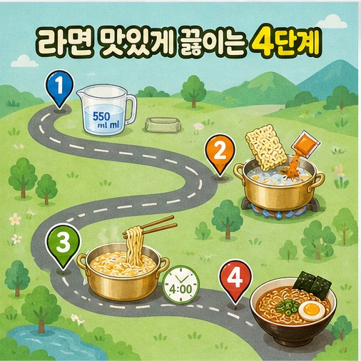
9. 로드맵
추천 용도 절차 안내, 사용법
시각 문법 구불구불한 경로, 이정표, 도착점, 진행 단계
제공된 소스를 분석하여 하나의 완결된 인포그래픽으로 구성해줘. 전체 내용을 로드맵 스타일로 표현하고, 구불구불한 경로, 이정표, 도착점, 진행 단계을 핵심 시각 문법으로 사용해. 중앙 또는 첫 구역에 명확한 제목을 배치하고, 핵심 정보를 4~6개 구역으로 나눠 번호·아이콘·화살표·연결선으로 읽는 순서를 보여줘. 각 구역은 짧은 제목과 1~2문장의 설명만 사용하며, 중요한 수치와 결론은 크게 강조해. 장식보다 정보 관계와 한글 가독성을 우선하고, 제공된 소스에 없는 사실은 추가하지 마. 로고와 워터마크 없이 16:9 가로 화면으로 제작해.
Analyze the provided sources and turn them into one self-contained infographic in a 로드맵 visual style. Use 구불구불한 경로, 이정표, 도착점, 진행 단계 as the core visual language. Place a clear title in the center or opening section, divide the content into four to six information zones, and show the reading order with numbers, icons, arrows, and connector lines. Give each zone a short heading and only one or two concise sentences. Enlarge key figures and conclusions. Prioritize information relationships and legibility over decoration, add no facts unsupported by the sources, and create a 16:9 landscape composition with no logos or watermarks.
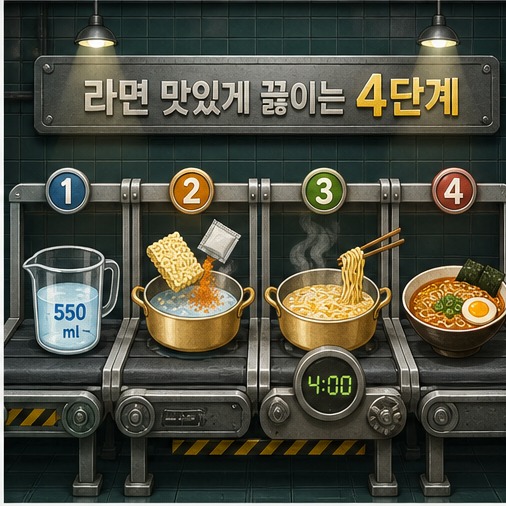
10. 컨베이어 벨트
추천 용도 절차 안내, 사용법
시각 문법 공정별 작업대와 이동하는 재료, 미니어처 장면
제공된 소스를 분석하여 하나의 완결된 인포그래픽으로 구성해줘. 전체 내용을 컨베이어 벨트 스타일로 표현하고, 공정별 작업대와 이동하는 재료, 미니어처 장면을 핵심 시각 문법으로 사용해. 중앙 또는 첫 구역에 명확한 제목을 배치하고, 핵심 정보를 4~6개 구역으로 나눠 번호·아이콘·화살표·연결선으로 읽는 순서를 보여줘. 각 구역은 짧은 제목과 1~2문장의 설명만 사용하며, 중요한 수치와 결론은 크게 강조해. 장식보다 정보 관계와 한글 가독성을 우선하고, 제공된 소스에 없는 사실은 추가하지 마. 로고와 워터마크 없이 16:9 가로 화면으로 제작해.
Analyze the provided sources and turn them into one self-contained infographic in a 컨베이어 벨트 visual style. Use 공정별 작업대와 이동하는 재료, 미니어처 장면 as the core visual language. Place a clear title in the center or opening section, divide the content into four to six information zones, and show the reading order with numbers, icons, arrows, and connector lines. Give each zone a short heading and only one or two concise sentences. Enlarge key figures and conclusions. Prioritize information relationships and legibility over decoration, add no facts unsupported by the sources, and create a 16:9 landscape composition with no logos or watermarks.
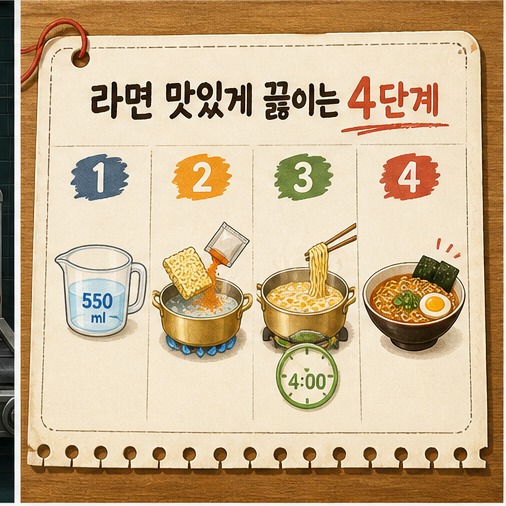
11. 레시피 카드
추천 용도 절차 안내, 사용법
시각 문법 재료 카드와 조리 순서를 결합한 주방 레시피
제공된 소스를 분석하여 하나의 완결된 인포그래픽으로 구성해줘. 전체 내용을 레시피 카드 스타일로 표현하고, 재료 카드와 조리 순서를 결합한 주방 레시피을 핵심 시각 문법으로 사용해. 중앙 또는 첫 구역에 명확한 제목을 배치하고, 핵심 정보를 4~6개 구역으로 나눠 번호·아이콘·화살표·연결선으로 읽는 순서를 보여줘. 각 구역은 짧은 제목과 1~2문장의 설명만 사용하며, 중요한 수치와 결론은 크게 강조해. 장식보다 정보 관계와 한글 가독성을 우선하고, 제공된 소스에 없는 사실은 추가하지 마. 로고와 워터마크 없이 16:9 가로 화면으로 제작해.
Analyze the provided sources and turn them into one self-contained infographic in a 레시피 카드 visual style. Use 재료 카드와 조리 순서를 결합한 주방 레시피 as the core visual language. Place a clear title in the center or opening section, divide the content into four to six information zones, and show the reading order with numbers, icons, arrows, and connector lines. Give each zone a short heading and only one or two concise sentences. Enlarge key figures and conclusions. Prioritize information relationships and legibility over decoration, add no facts unsupported by the sources, and create a 16:9 landscape composition with no logos or watermarks.
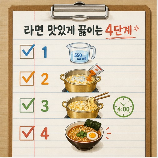
12. 체크리스트
추천 용도 절차 안내, 사용법
시각 문법 체크박스, 준비물, 단계별 완료 표시
제공된 소스를 분석하여 하나의 완결된 인포그래픽으로 구성해줘. 전체 내용을 체크리스트 스타일로 표현하고, 체크박스, 준비물, 단계별 완료 표시을 핵심 시각 문법으로 사용해. 중앙 또는 첫 구역에 명확한 제목을 배치하고, 핵심 정보를 4~6개 구역으로 나눠 번호·아이콘·화살표·연결선으로 읽는 순서를 보여줘. 각 구역은 짧은 제목과 1~2문장의 설명만 사용하며, 중요한 수치와 결론은 크게 강조해. 장식보다 정보 관계와 한글 가독성을 우선하고, 제공된 소스에 없는 사실은 추가하지 마. 로고와 워터마크 없이 16:9 가로 화면으로 제작해.
Analyze the provided sources and turn them into one self-contained infographic in a 체크리스트 visual style. Use 체크박스, 준비물, 단계별 완료 표시 as the core visual language. Place a clear title in the center or opening section, divide the content into four to six information zones, and show the reading order with numbers, icons, arrows, and connector lines. Give each zone a short heading and only one or two concise sentences. Enlarge key figures and conclusions. Prioritize information relationships and legibility over decoration, add no facts unsupported by the sources, and create a 16:9 landscape composition with no logos or watermarks.
3. 비교·선택형
양자택일 비교 · 비교 매트릭스 · 비포·애프터 · 의사결정 트리 · 문제·해결 · 해야 할 것·피할 것
13. 양자택일 비교
추천 용도 비교, 선택, 의사결정
시각 문법 좌우 2열 비교, 공통 기준, 선택 결과
제공된 소스를 분석하여 하나의 완결된 인포그래픽으로 구성해줘. 전체 내용을 양자택일 비교 스타일로 표현하고, 좌우 2열 비교, 공통 기준, 선택 결과을 핵심 시각 문법으로 사용해. 중앙 또는 첫 구역에 명확한 제목을 배치하고, 핵심 정보를 4~6개 구역으로 나눠 번호·아이콘·화살표·연결선으로 읽는 순서를 보여줘. 각 구역은 짧은 제목과 1~2문장의 설명만 사용하며, 중요한 수치와 결론은 크게 강조해. 장식보다 정보 관계와 한글 가독성을 우선하고, 제공된 소스에 없는 사실은 추가하지 마. 로고와 워터마크 없이 16:9 가로 화면으로 제작해.
Analyze the provided sources and turn them into one self-contained infographic in a 양자택일 비교 visual style. Use 좌우 2열 비교, 공통 기준, 선택 결과 as the core visual language. Place a clear title in the center or opening section, divide the content into four to six information zones, and show the reading order with numbers, icons, arrows, and connector lines. Give each zone a short heading and only one or two concise sentences. Enlarge key figures and conclusions. Prioritize information relationships and legibility over decoration, add no facts unsupported by the sources, and create a 16:9 landscape composition with no logos or watermarks.
14. 비교 매트릭스
추천 용도 비교, 선택, 의사결정
시각 문법 행과 열로 정리한 조건·결과 표, 아이콘 헤더
제공된 소스를 분석하여 하나의 완결된 인포그래픽으로 구성해줘. 전체 내용을 비교 매트릭스 스타일로 표현하고, 행과 열로 정리한 조건·결과 표, 아이콘 헤더을 핵심 시각 문법으로 사용해. 중앙 또는 첫 구역에 명확한 제목을 배치하고, 핵심 정보를 4~6개 구역으로 나눠 번호·아이콘·화살표·연결선으로 읽는 순서를 보여줘. 각 구역은 짧은 제목과 1~2문장의 설명만 사용하며, 중요한 수치와 결론은 크게 강조해. 장식보다 정보 관계와 한글 가독성을 우선하고, 제공된 소스에 없는 사실은 추가하지 마. 로고와 워터마크 없이 16:9 가로 화면으로 제작해.
Analyze the provided sources and turn them into one self-contained infographic in a 비교 매트릭스 visual style. Use 행과 열로 정리한 조건·결과 표, 아이콘 헤더 as the core visual language. Place a clear title in the center or opening section, divide the content into four to six information zones, and show the reading order with numbers, icons, arrows, and connector lines. Give each zone a short heading and only one or two concise sentences. Enlarge key figures and conclusions. Prioritize information relationships and legibility over decoration, add no facts unsupported by the sources, and create a 16:9 landscape composition with no logos or watermarks.
15. 비포·애프터
추천 용도 비교, 선택, 의사결정
시각 문법 조리 전과 완성 후를 나눈 대비 화면
제공된 소스를 분석하여 하나의 완결된 인포그래픽으로 구성해줘. 전체 내용을 비포·애프터 스타일로 표현하고, 조리 전과 완성 후를 나눈 대비 화면을 핵심 시각 문법으로 사용해. 중앙 또는 첫 구역에 명확한 제목을 배치하고, 핵심 정보를 4~6개 구역으로 나눠 번호·아이콘·화살표·연결선으로 읽는 순서를 보여줘. 각 구역은 짧은 제목과 1~2문장의 설명만 사용하며, 중요한 수치와 결론은 크게 강조해. 장식보다 정보 관계와 한글 가독성을 우선하고, 제공된 소스에 없는 사실은 추가하지 마. 로고와 워터마크 없이 16:9 가로 화면으로 제작해.
Analyze the provided sources and turn them into one self-contained infographic in a 비포·애프터 visual style. Use 조리 전과 완성 후를 나눈 대비 화면 as the core visual language. Place a clear title in the center or opening section, divide the content into four to six information zones, and show the reading order with numbers, icons, arrows, and connector lines. Give each zone a short heading and only one or two concise sentences. Enlarge key figures and conclusions. Prioritize information relationships and legibility over decoration, add no facts unsupported by the sources, and create a 16:9 landscape composition with no logos or watermarks.
16. 의사결정 트리
추천 용도 비교, 선택, 의사결정
시각 문법 질문 노드와 예·아니오 분기, 추천 결과
제공된 소스를 분석하여 하나의 완결된 인포그래픽으로 구성해줘. 전체 내용을 의사결정 트리 스타일로 표현하고, 질문 노드와 예·아니오 분기, 추천 결과을 핵심 시각 문법으로 사용해. 중앙 또는 첫 구역에 명확한 제목을 배치하고, 핵심 정보를 4~6개 구역으로 나눠 번호·아이콘·화살표·연결선으로 읽는 순서를 보여줘. 각 구역은 짧은 제목과 1~2문장의 설명만 사용하며, 중요한 수치와 결론은 크게 강조해. 장식보다 정보 관계와 한글 가독성을 우선하고, 제공된 소스에 없는 사실은 추가하지 마. 로고와 워터마크 없이 16:9 가로 화면으로 제작해.
Analyze the provided sources and turn them into one self-contained infographic in a 의사결정 트리 visual style. Use 질문 노드와 예·아니오 분기, 추천 결과 as the core visual language. Place a clear title in the center or opening section, divide the content into four to six information zones, and show the reading order with numbers, icons, arrows, and connector lines. Give each zone a short heading and only one or two concise sentences. Enlarge key figures and conclusions. Prioritize information relationships and legibility over decoration, add no facts unsupported by the sources, and create a 16:9 landscape composition with no logos or watermarks.
17. 문제·해결
추천 용도 비교, 선택, 의사결정
시각 문법 왼쪽 실패 원인, 오른쪽 해결 방법, 중앙 전환 화살표
제공된 소스를 분석하여 하나의 완결된 인포그래픽으로 구성해줘. 전체 내용을 문제·해결 스타일로 표현하고, 왼쪽 실패 원인, 오른쪽 해결 방법, 중앙 전환 화살표을 핵심 시각 문법으로 사용해. 중앙 또는 첫 구역에 명확한 제목을 배치하고, 핵심 정보를 4~6개 구역으로 나눠 번호·아이콘·화살표·연결선으로 읽는 순서를 보여줘. 각 구역은 짧은 제목과 1~2문장의 설명만 사용하며, 중요한 수치와 결론은 크게 강조해. 장식보다 정보 관계와 한글 가독성을 우선하고, 제공된 소스에 없는 사실은 추가하지 마. 로고와 워터마크 없이 16:9 가로 화면으로 제작해.
Analyze the provided sources and turn them into one self-contained infographic in a 문제·해결 visual style. Use 왼쪽 실패 원인, 오른쪽 해결 방법, 중앙 전환 화살표 as the core visual language. Place a clear title in the center or opening section, divide the content into four to six information zones, and show the reading order with numbers, icons, arrows, and connector lines. Give each zone a short heading and only one or two concise sentences. Enlarge key figures and conclusions. Prioritize information relationships and legibility over decoration, add no facts unsupported by the sources, and create a 16:9 landscape composition with no logos or watermarks.
18. 해야 할 것·피할 것
추천 용도 비교, 선택, 의사결정
시각 문법 DO와 DON'T의 대칭 카드, 체크와 금지 아이콘
제공된 소스를 분석하여 하나의 완결된 인포그래픽으로 구성해줘. 전체 내용을 해야 할 것·피할 것 스타일로 표현하고, DO와 DON'T의 대칭 카드, 체크와 금지 아이콘을 핵심 시각 문법으로 사용해. 중앙 또는 첫 구역에 명확한 제목을 배치하고, 핵심 정보를 4~6개 구역으로 나눠 번호·아이콘·화살표·연결선으로 읽는 순서를 보여줘. 각 구역은 짧은 제목과 1~2문장의 설명만 사용하며, 중요한 수치와 결론은 크게 강조해. 장식보다 정보 관계와 한글 가독성을 우선하고, 제공된 소스에 없는 사실은 추가하지 마. 로고와 워터마크 없이 16:9 가로 화면으로 제작해.
Analyze the provided sources and turn them into one self-contained infographic in a 해야 할 것·피할 것 visual style. Use DO와 DON'T의 대칭 카드, 체크와 금지 아이콘 as the core visual language. Place a clear title in the center or opening section, divide the content into four to six information zones, and show the reading order with numbers, icons, arrows, and connector lines. Give each zone a short heading and only one or two concise sentences. Enlarge key figures and conclusions. Prioritize information relationships and legibility over decoration, add no facts unsupported by the sources, and create a 16:9 landscape composition with no logos or watermarks.
4. 구조·원리형
해부도 · 분해도 · 중앙 방사형 · 레이어 스택 · 단면도 · 원인·결과
19. 해부도
추천 용도 구조 설명, 원리 해설
시각 문법 완성된 라면을 중심으로 재료와 역할을 라벨링
제공된 소스를 분석하여 하나의 완결된 인포그래픽으로 구성해줘. 전체 내용을 해부도 스타일로 표현하고, 완성된 라면을 중심으로 재료와 역할을 라벨링을 핵심 시각 문법으로 사용해. 중앙 또는 첫 구역에 명확한 제목을 배치하고, 핵심 정보를 4~6개 구역으로 나눠 번호·아이콘·화살표·연결선으로 읽는 순서를 보여줘. 각 구역은 짧은 제목과 1~2문장의 설명만 사용하며, 중요한 수치와 결론은 크게 강조해. 장식보다 정보 관계와 한글 가독성을 우선하고, 제공된 소스에 없는 사실은 추가하지 마. 로고와 워터마크 없이 16:9 가로 화면으로 제작해.
Analyze the provided sources and turn them into one self-contained infographic in a 해부도 visual style. Use 완성된 라면을 중심으로 재료와 역할을 라벨링 as the core visual language. Place a clear title in the center or opening section, divide the content into four to six information zones, and show the reading order with numbers, icons, arrows, and connector lines. Give each zone a short heading and only one or two concise sentences. Enlarge key figures and conclusions. Prioritize information relationships and legibility over decoration, add no facts unsupported by the sources, and create a 16:9 landscape composition with no logos or watermarks.
20. 분해도
추천 용도 구조 설명, 원리 해설
시각 문법 냄비·면·수프·고명을 층별로 분리한 폭발도
제공된 소스를 분석하여 하나의 완결된 인포그래픽으로 구성해줘. 전체 내용을 분해도 스타일로 표현하고, 냄비·면·수프·고명을 층별로 분리한 폭발도을 핵심 시각 문법으로 사용해. 중앙 또는 첫 구역에 명확한 제목을 배치하고, 핵심 정보를 4~6개 구역으로 나눠 번호·아이콘·화살표·연결선으로 읽는 순서를 보여줘. 각 구역은 짧은 제목과 1~2문장의 설명만 사용하며, 중요한 수치와 결론은 크게 강조해. 장식보다 정보 관계와 한글 가독성을 우선하고, 제공된 소스에 없는 사실은 추가하지 마. 로고와 워터마크 없이 16:9 가로 화면으로 제작해.
Analyze the provided sources and turn them into one self-contained infographic in a 분해도 visual style. Use 냄비·면·수프·고명을 층별로 분리한 폭발도 as the core visual language. Place a clear title in the center or opening section, divide the content into four to six information zones, and show the reading order with numbers, icons, arrows, and connector lines. Give each zone a short heading and only one or two concise sentences. Enlarge key figures and conclusions. Prioritize information relationships and legibility over decoration, add no facts unsupported by the sources, and create a 16:9 landscape composition with no logos or watermarks.
21. 중앙 방사형
추천 용도 구조 설명, 원리 해설
시각 문법 중앙 냄비에서 4가지 핵심 요소가 사방으로 확장
제공된 소스를 분석하여 하나의 완결된 인포그래픽으로 구성해줘. 전체 내용을 중앙 방사형 스타일로 표현하고, 중앙 냄비에서 4가지 핵심 요소가 사방으로 확장을 핵심 시각 문법으로 사용해. 중앙 또는 첫 구역에 명확한 제목을 배치하고, 핵심 정보를 4~6개 구역으로 나눠 번호·아이콘·화살표·연결선으로 읽는 순서를 보여줘. 각 구역은 짧은 제목과 1~2문장의 설명만 사용하며, 중요한 수치와 결론은 크게 강조해. 장식보다 정보 관계와 한글 가독성을 우선하고, 제공된 소스에 없는 사실은 추가하지 마. 로고와 워터마크 없이 16:9 가로 화면으로 제작해.
Analyze the provided sources and turn them into one self-contained infographic in a 중앙 방사형 visual style. Use 중앙 냄비에서 4가지 핵심 요소가 사방으로 확장 as the core visual language. Place a clear title in the center or opening section, divide the content into four to six information zones, and show the reading order with numbers, icons, arrows, and connector lines. Give each zone a short heading and only one or two concise sentences. Enlarge key figures and conclusions. Prioritize information relationships and legibility over decoration, add no facts unsupported by the sources, and create a 16:9 landscape composition with no logos or watermarks.
22. 레이어 스택
추천 용도 구조 설명, 원리 해설
시각 문법 맛을 만드는 요소를 아래에서 위로 쌓은 층 구조
제공된 소스를 분석하여 하나의 완결된 인포그래픽으로 구성해줘. 전체 내용을 레이어 스택 스타일로 표현하고, 맛을 만드는 요소를 아래에서 위로 쌓은 층 구조을 핵심 시각 문법으로 사용해. 중앙 또는 첫 구역에 명확한 제목을 배치하고, 핵심 정보를 4~6개 구역으로 나눠 번호·아이콘·화살표·연결선으로 읽는 순서를 보여줘. 각 구역은 짧은 제목과 1~2문장의 설명만 사용하며, 중요한 수치와 결론은 크게 강조해. 장식보다 정보 관계와 한글 가독성을 우선하고, 제공된 소스에 없는 사실은 추가하지 마. 로고와 워터마크 없이 16:9 가로 화면으로 제작해.
Analyze the provided sources and turn them into one self-contained infographic in a 레이어 스택 visual style. Use 맛을 만드는 요소를 아래에서 위로 쌓은 층 구조 as the core visual language. Place a clear title in the center or opening section, divide the content into four to six information zones, and show the reading order with numbers, icons, arrows, and connector lines. Give each zone a short heading and only one or two concise sentences. Enlarge key figures and conclusions. Prioritize information relationships and legibility over decoration, add no facts unsupported by the sources, and create a 16:9 landscape composition with no logos or watermarks.
23. 단면도
추천 용도 구조 설명, 원리 해설
시각 문법 냄비 속 수위·면·열 흐름을 절개해 설명
제공된 소스를 분석하여 하나의 완결된 인포그래픽으로 구성해줘. 전체 내용을 단면도 스타일로 표현하고, 냄비 속 수위·면·열 흐름을 절개해 설명을 핵심 시각 문법으로 사용해. 중앙 또는 첫 구역에 명확한 제목을 배치하고, 핵심 정보를 4~6개 구역으로 나눠 번호·아이콘·화살표·연결선으로 읽는 순서를 보여줘. 각 구역은 짧은 제목과 1~2문장의 설명만 사용하며, 중요한 수치와 결론은 크게 강조해. 장식보다 정보 관계와 한글 가독성을 우선하고, 제공된 소스에 없는 사실은 추가하지 마. 로고와 워터마크 없이 16:9 가로 화면으로 제작해.
Analyze the provided sources and turn them into one self-contained infographic in a 단면도 visual style. Use 냄비 속 수위·면·열 흐름을 절개해 설명 as the core visual language. Place a clear title in the center or opening section, divide the content into four to six information zones, and show the reading order with numbers, icons, arrows, and connector lines. Give each zone a short heading and only one or two concise sentences. Enlarge key figures and conclusions. Prioritize information relationships and legibility over decoration, add no facts unsupported by the sources, and create a 16:9 landscape composition with no logos or watermarks.
24. 원인·결과
추천 용도 구조 설명, 원리 해설
시각 문법 조리 행동과 맛의 변화를 화살표로 연결
제공된 소스를 분석하여 하나의 완결된 인포그래픽으로 구성해줘. 전체 내용을 원인·결과 스타일로 표현하고, 조리 행동과 맛의 변화를 화살표로 연결을 핵심 시각 문법으로 사용해. 중앙 또는 첫 구역에 명확한 제목을 배치하고, 핵심 정보를 4~6개 구역으로 나눠 번호·아이콘·화살표·연결선으로 읽는 순서를 보여줘. 각 구역은 짧은 제목과 1~2문장의 설명만 사용하며, 중요한 수치와 결론은 크게 강조해. 장식보다 정보 관계와 한글 가독성을 우선하고, 제공된 소스에 없는 사실은 추가하지 마. 로고와 워터마크 없이 16:9 가로 화면으로 제작해.
Analyze the provided sources and turn them into one self-contained infographic in a 원인·결과 visual style. Use 조리 행동과 맛의 변화를 화살표로 연결 as the core visual language. Place a clear title in the center or opening section, divide the content into four to six information zones, and show the reading order with numbers, icons, arrows, and connector lines. Give each zone a short heading and only one or two concise sentences. Enlarge key figures and conclusions. Prioritize information relationships and legibility over decoration, add no facts unsupported by the sources, and create a 16:9 landscape composition with no logos or watermarks.
5. 데이터·시스템형
대시보드 · 플로차트 · 퍼널 · 순환 다이어그램 · 흐름 지도 · KPI 카드
25. 대시보드
추천 용도 데이터 요약, 시스템 흐름
시각 문법 시간·물양·불세기를 KPI 카드와 게이지로 표시
제공된 소스를 분석하여 하나의 완결된 인포그래픽으로 구성해줘. 전체 내용을 대시보드 스타일로 표현하고, 시간·물양·불세기를 KPI 카드와 게이지로 표시을 핵심 시각 문법으로 사용해. 중앙 또는 첫 구역에 명확한 제목을 배치하고, 핵심 정보를 4~6개 구역으로 나눠 번호·아이콘·화살표·연결선으로 읽는 순서를 보여줘. 각 구역은 짧은 제목과 1~2문장의 설명만 사용하며, 중요한 수치와 결론은 크게 강조해. 장식보다 정보 관계와 한글 가독성을 우선하고, 제공된 소스에 없는 사실은 추가하지 마. 로고와 워터마크 없이 16:9 가로 화면으로 제작해.
Analyze the provided sources and turn them into one self-contained infographic in a 대시보드 visual style. Use 시간·물양·불세기를 KPI 카드와 게이지로 표시 as the core visual language. Place a clear title in the center or opening section, divide the content into four to six information zones, and show the reading order with numbers, icons, arrows, and connector lines. Give each zone a short heading and only one or two concise sentences. Enlarge key figures and conclusions. Prioritize information relationships and legibility over decoration, add no facts unsupported by the sources, and create a 16:9 landscape composition with no logos or watermarks.
26. 플로차트
추천 용도 데이터 요약, 시스템 흐름
시각 문법 시작부터 완성까지 표준 도형과 조건 분기
제공된 소스를 분석하여 하나의 완결된 인포그래픽으로 구성해줘. 전체 내용을 플로차트 스타일로 표현하고, 시작부터 완성까지 표준 도형과 조건 분기을 핵심 시각 문법으로 사용해. 중앙 또는 첫 구역에 명확한 제목을 배치하고, 핵심 정보를 4~6개 구역으로 나눠 번호·아이콘·화살표·연결선으로 읽는 순서를 보여줘. 각 구역은 짧은 제목과 1~2문장의 설명만 사용하며, 중요한 수치와 결론은 크게 강조해. 장식보다 정보 관계와 한글 가독성을 우선하고, 제공된 소스에 없는 사실은 추가하지 마. 로고와 워터마크 없이 16:9 가로 화면으로 제작해.
Analyze the provided sources and turn them into one self-contained infographic in a 플로차트 visual style. Use 시작부터 완성까지 표준 도형과 조건 분기 as the core visual language. Place a clear title in the center or opening section, divide the content into four to six information zones, and show the reading order with numbers, icons, arrows, and connector lines. Give each zone a short heading and only one or two concise sentences. Enlarge key figures and conclusions. Prioritize information relationships and legibility over decoration, add no facts unsupported by the sources, and create a 16:9 landscape composition with no logos or watermarks.
27. 퍼널
추천 용도 데이터 요약, 시스템 흐름
시각 문법 준비 재료가 단계마다 좁혀져 한 그릇으로 완성
제공된 소스를 분석하여 하나의 완결된 인포그래픽으로 구성해줘. 전체 내용을 퍼널 스타일로 표현하고, 준비 재료가 단계마다 좁혀져 한 그릇으로 완성을 핵심 시각 문법으로 사용해. 중앙 또는 첫 구역에 명확한 제목을 배치하고, 핵심 정보를 4~6개 구역으로 나눠 번호·아이콘·화살표·연결선으로 읽는 순서를 보여줘. 각 구역은 짧은 제목과 1~2문장의 설명만 사용하며, 중요한 수치와 결론은 크게 강조해. 장식보다 정보 관계와 한글 가독성을 우선하고, 제공된 소스에 없는 사실은 추가하지 마. 로고와 워터마크 없이 16:9 가로 화면으로 제작해.
Analyze the provided sources and turn them into one self-contained infographic in a 퍼널 visual style. Use 준비 재료가 단계마다 좁혀져 한 그릇으로 완성 as the core visual language. Place a clear title in the center or opening section, divide the content into four to six information zones, and show the reading order with numbers, icons, arrows, and connector lines. Give each zone a short heading and only one or two concise sentences. Enlarge key figures and conclusions. Prioritize information relationships and legibility over decoration, add no facts unsupported by the sources, and create a 16:9 landscape composition with no logos or watermarks.
28. 순환 다이어그램
추천 용도 데이터 요약, 시스템 흐름
시각 문법 끓이기·투입·저어주기·마무리의 반복 고리
제공된 소스를 분석하여 하나의 완결된 인포그래픽으로 구성해줘. 전체 내용을 순환 다이어그램 스타일로 표현하고, 끓이기·투입·저어주기·마무리의 반복 고리을 핵심 시각 문법으로 사용해. 중앙 또는 첫 구역에 명확한 제목을 배치하고, 핵심 정보를 4~6개 구역으로 나눠 번호·아이콘·화살표·연결선으로 읽는 순서를 보여줘. 각 구역은 짧은 제목과 1~2문장의 설명만 사용하며, 중요한 수치와 결론은 크게 강조해. 장식보다 정보 관계와 한글 가독성을 우선하고, 제공된 소스에 없는 사실은 추가하지 마. 로고와 워터마크 없이 16:9 가로 화면으로 제작해.
Analyze the provided sources and turn them into one self-contained infographic in a 순환 다이어그램 visual style. Use 끓이기·투입·저어주기·마무리의 반복 고리 as the core visual language. Place a clear title in the center or opening section, divide the content into four to six information zones, and show the reading order with numbers, icons, arrows, and connector lines. Give each zone a short heading and only one or two concise sentences. Enlarge key figures and conclusions. Prioritize information relationships and legibility over decoration, add no facts unsupported by the sources, and create a 16:9 landscape composition with no logos or watermarks.
29. 흐름 지도
추천 용도 데이터 요약, 시스템 흐름
시각 문법 물·열·재료의 세 흐름이 합쳐지는 시스템 지도
제공된 소스를 분석하여 하나의 완결된 인포그래픽으로 구성해줘. 전체 내용을 흐름 지도 스타일로 표현하고, 물·열·재료의 세 흐름이 합쳐지는 시스템 지도을 핵심 시각 문법으로 사용해. 중앙 또는 첫 구역에 명확한 제목을 배치하고, 핵심 정보를 4~6개 구역으로 나눠 번호·아이콘·화살표·연결선으로 읽는 순서를 보여줘. 각 구역은 짧은 제목과 1~2문장의 설명만 사용하며, 중요한 수치와 결론은 크게 강조해. 장식보다 정보 관계와 한글 가독성을 우선하고, 제공된 소스에 없는 사실은 추가하지 마. 로고와 워터마크 없이 16:9 가로 화면으로 제작해.
Analyze the provided sources and turn them into one self-contained infographic in a 흐름 지도 visual style. Use 물·열·재료의 세 흐름이 합쳐지는 시스템 지도 as the core visual language. Place a clear title in the center or opening section, divide the content into four to six information zones, and show the reading order with numbers, icons, arrows, and connector lines. Give each zone a short heading and only one or two concise sentences. Enlarge key figures and conclusions. Prioritize information relationships and legibility over decoration, add no facts unsupported by the sources, and create a 16:9 landscape composition with no logos or watermarks.
30. KPI 카드
추천 용도 데이터 요약, 시스템 흐름
시각 문법 550ml·4분·강불 등 핵심 수치를 대형 카드로 강조
제공된 소스를 분석하여 하나의 완결된 인포그래픽으로 구성해줘. 전체 내용을 KPI 카드 스타일로 표현하고, 550ml·4분·강불 등 핵심 수치를 대형 카드로 강조을 핵심 시각 문법으로 사용해. 중앙 또는 첫 구역에 명확한 제목을 배치하고, 핵심 정보를 4~6개 구역으로 나눠 번호·아이콘·화살표·연결선으로 읽는 순서를 보여줘. 각 구역은 짧은 제목과 1~2문장의 설명만 사용하며, 중요한 수치와 결론은 크게 강조해. 장식보다 정보 관계와 한글 가독성을 우선하고, 제공된 소스에 없는 사실은 추가하지 마. 로고와 워터마크 없이 16:9 가로 화면으로 제작해.
Analyze the provided sources and turn them into one self-contained infographic in a KPI 카드 visual style. Use 550ml·4분·강불 등 핵심 수치를 대형 카드로 강조 as the core visual language. Place a clear title in the center or opening section, divide the content into four to six information zones, and show the reading order with numbers, icons, arrows, and connector lines. Give each zone a short heading and only one or two concise sentences. Enlarge key figures and conclusions. Prioritize information relationships and legibility over decoration, add no facts unsupported by the sources, and create a 16:9 landscape composition with no logos or watermarks.
6. 만화·캐릭터형
교육 만화 · 미국 코믹북 · 일본 학습만화 · 일본 애니메이션 · 카와이 · 마스코트 가이드
31. 교육 만화
추천 용도 친근한 교육, 스토리텔링
시각 문법 4컷 패널, 말풍선, 친근한 조리 장면
제공된 소스를 분석하여 하나의 완결된 인포그래픽으로 구성해줘. 전체 내용을 교육 만화 스타일로 표현하고, 4컷 패널, 말풍선, 친근한 조리 장면을 핵심 시각 문법으로 사용해. 중앙 또는 첫 구역에 명확한 제목을 배치하고, 핵심 정보를 4~6개 구역으로 나눠 번호·아이콘·화살표·연결선으로 읽는 순서를 보여줘. 각 구역은 짧은 제목과 1~2문장의 설명만 사용하며, 중요한 수치와 결론은 크게 강조해. 장식보다 정보 관계와 한글 가독성을 우선하고, 제공된 소스에 없는 사실은 추가하지 마. 로고와 워터마크 없이 16:9 가로 화면으로 제작해.
Analyze the provided sources and turn them into one self-contained infographic in a 교육 만화 visual style. Use 4컷 패널, 말풍선, 친근한 조리 장면 as the core visual language. Place a clear title in the center or opening section, divide the content into four to six information zones, and show the reading order with numbers, icons, arrows, and connector lines. Give each zone a short heading and only one or two concise sentences. Enlarge key figures and conclusions. Prioritize information relationships and legibility over decoration, add no facts unsupported by the sources, and create a 16:9 landscape composition with no logos or watermarks.
32. 미국 코믹북
추천 용도 친근한 교육, 스토리텔링
시각 문법 굵은 잉크선, 하프톤, 폭발형 캡션, 역동적 구도
제공된 소스를 분석하여 하나의 완결된 인포그래픽으로 구성해줘. 전체 내용을 미국 코믹북 스타일로 표현하고, 굵은 잉크선, 하프톤, 폭발형 캡션, 역동적 구도을 핵심 시각 문법으로 사용해. 중앙 또는 첫 구역에 명확한 제목을 배치하고, 핵심 정보를 4~6개 구역으로 나눠 번호·아이콘·화살표·연결선으로 읽는 순서를 보여줘. 각 구역은 짧은 제목과 1~2문장의 설명만 사용하며, 중요한 수치와 결론은 크게 강조해. 장식보다 정보 관계와 한글 가독성을 우선하고, 제공된 소스에 없는 사실은 추가하지 마. 로고와 워터마크 없이 16:9 가로 화면으로 제작해.
Analyze the provided sources and turn them into one self-contained infographic in a 미국 코믹북 visual style. Use 굵은 잉크선, 하프톤, 폭발형 캡션, 역동적 구도 as the core visual language. Place a clear title in the center or opening section, divide the content into four to six information zones, and show the reading order with numbers, icons, arrows, and connector lines. Give each zone a short heading and only one or two concise sentences. Enlarge key figures and conclusions. Prioritize information relationships and legibility over decoration, add no facts unsupported by the sources, and create a 16:9 landscape composition with no logos or watermarks.
33. 일본 학습만화
추천 용도 친근한 교육, 스토리텔링
시각 문법 흑백 펜선, 속도선, 해설 박스, 표정 강조
제공된 소스를 분석하여 하나의 완결된 인포그래픽으로 구성해줘. 전체 내용을 일본 학습만화 스타일로 표현하고, 흑백 펜선, 속도선, 해설 박스, 표정 강조을 핵심 시각 문법으로 사용해. 중앙 또는 첫 구역에 명확한 제목을 배치하고, 핵심 정보를 4~6개 구역으로 나눠 번호·아이콘·화살표·연결선으로 읽는 순서를 보여줘. 각 구역은 짧은 제목과 1~2문장의 설명만 사용하며, 중요한 수치와 결론은 크게 강조해. 장식보다 정보 관계와 한글 가독성을 우선하고, 제공된 소스에 없는 사실은 추가하지 마. 로고와 워터마크 없이 16:9 가로 화면으로 제작해.
Analyze the provided sources and turn them into one self-contained infographic in a 일본 학습만화 visual style. Use 흑백 펜선, 속도선, 해설 박스, 표정 강조 as the core visual language. Place a clear title in the center or opening section, divide the content into four to six information zones, and show the reading order with numbers, icons, arrows, and connector lines. Give each zone a short heading and only one or two concise sentences. Enlarge key figures and conclusions. Prioritize information relationships and legibility over decoration, add no facts unsupported by the sources, and create a 16:9 landscape composition with no logos or watermarks.
34. 일본 애니메이션
추천 용도 친근한 교육, 스토리텔링
시각 문법 선명한 셀 채색, 주방 장면, 단계별 캐릭터 행동
제공된 소스를 분석하여 하나의 완결된 인포그래픽으로 구성해줘. 전체 내용을 일본 애니메이션 스타일로 표현하고, 선명한 셀 채색, 주방 장면, 단계별 캐릭터 행동을 핵심 시각 문법으로 사용해. 중앙 또는 첫 구역에 명확한 제목을 배치하고, 핵심 정보를 4~6개 구역으로 나눠 번호·아이콘·화살표·연결선으로 읽는 순서를 보여줘. 각 구역은 짧은 제목과 1~2문장의 설명만 사용하며, 중요한 수치와 결론은 크게 강조해. 장식보다 정보 관계와 한글 가독성을 우선하고, 제공된 소스에 없는 사실은 추가하지 마. 로고와 워터마크 없이 16:9 가로 화면으로 제작해.
Analyze the provided sources and turn them into one self-contained infographic in a 일본 애니메이션 visual style. Use 선명한 셀 채색, 주방 장면, 단계별 캐릭터 행동 as the core visual language. Place a clear title in the center or opening section, divide the content into four to six information zones, and show the reading order with numbers, icons, arrows, and connector lines. Give each zone a short heading and only one or two concise sentences. Enlarge key figures and conclusions. Prioritize information relationships and legibility over decoration, add no facts unsupported by the sources, and create a 16:9 landscape composition with no logos or watermarks.
35. 카와이
추천 용도 친근한 교육, 스토리텔링
시각 문법 둥근 캐릭터, 얼굴이 있는 재료, 파스텔 장식
제공된 소스를 분석하여 하나의 완결된 인포그래픽으로 구성해줘. 전체 내용을 카와이 스타일로 표현하고, 둥근 캐릭터, 얼굴이 있는 재료, 파스텔 장식을 핵심 시각 문법으로 사용해. 중앙 또는 첫 구역에 명확한 제목을 배치하고, 핵심 정보를 4~6개 구역으로 나눠 번호·아이콘·화살표·연결선으로 읽는 순서를 보여줘. 각 구역은 짧은 제목과 1~2문장의 설명만 사용하며, 중요한 수치와 결론은 크게 강조해. 장식보다 정보 관계와 한글 가독성을 우선하고, 제공된 소스에 없는 사실은 추가하지 마. 로고와 워터마크 없이 16:9 가로 화면으로 제작해.
Analyze the provided sources and turn them into one self-contained infographic in a 카와이 visual style. Use 둥근 캐릭터, 얼굴이 있는 재료, 파스텔 장식 as the core visual language. Place a clear title in the center or opening section, divide the content into four to six information zones, and show the reading order with numbers, icons, arrows, and connector lines. Give each zone a short heading and only one or two concise sentences. Enlarge key figures and conclusions. Prioritize information relationships and legibility over decoration, add no facts unsupported by the sources, and create a 16:9 landscape composition with no logos or watermarks.
36. 마스코트 가이드
추천 용도 친근한 교육, 스토리텔링
시각 문법 셰프 마스코트가 각 단계를 안내하는 카드
제공된 소스를 분석하여 하나의 완결된 인포그래픽으로 구성해줘. 전체 내용을 마스코트 가이드 스타일로 표현하고, 셰프 마스코트가 각 단계를 안내하는 카드을 핵심 시각 문법으로 사용해. 중앙 또는 첫 구역에 명확한 제목을 배치하고, 핵심 정보를 4~6개 구역으로 나눠 번호·아이콘·화살표·연결선으로 읽는 순서를 보여줘. 각 구역은 짧은 제목과 1~2문장의 설명만 사용하며, 중요한 수치와 결론은 크게 강조해. 장식보다 정보 관계와 한글 가독성을 우선하고, 제공된 소스에 없는 사실은 추가하지 마. 로고와 워터마크 없이 16:9 가로 화면으로 제작해.
Analyze the provided sources and turn them into one self-contained infographic in a 마스코트 가이드 visual style. Use 셰프 마스코트가 각 단계를 안내하는 카드 as the core visual language. Place a clear title in the center or opening section, divide the content into four to six information zones, and show the reading order with numbers, icons, arrows, and connector lines. Give each zone a short heading and only one or two concise sentences. Enlarge key figures and conclusions. Prioritize information relationships and legibility over decoration, add no facts unsupported by the sources, and create a 16:9 landscape composition with no logos or watermarks.
7. 디지털·게임형
픽셀아트 · 레트로 아케이드 · 앱 UI · 아이소메트릭 미니월드 · 클레이 3D · 글래스모피즘
37. 픽셀아트
추천 용도 디지털 서비스, 트렌드
시각 문법 8비트 아이콘, 타일 그리드, 게임 HUD, 픽셀 글자
제공된 소스를 분석하여 하나의 완결된 인포그래픽으로 구성해줘. 전체 내용을 픽셀아트 스타일로 표현하고, 8비트 아이콘, 타일 그리드, 게임 HUD, 픽셀 글자을 핵심 시각 문법으로 사용해. 중앙 또는 첫 구역에 명확한 제목을 배치하고, 핵심 정보를 4~6개 구역으로 나눠 번호·아이콘·화살표·연결선으로 읽는 순서를 보여줘. 각 구역은 짧은 제목과 1~2문장의 설명만 사용하며, 중요한 수치와 결론은 크게 강조해. 장식보다 정보 관계와 한글 가독성을 우선하고, 제공된 소스에 없는 사실은 추가하지 마. 로고와 워터마크 없이 16:9 가로 화면으로 제작해.
Analyze the provided sources and turn them into one self-contained infographic in a 픽셀아트 visual style. Use 8비트 아이콘, 타일 그리드, 게임 HUD, 픽셀 글자 as the core visual language. Place a clear title in the center or opening section, divide the content into four to six information zones, and show the reading order with numbers, icons, arrows, and connector lines. Give each zone a short heading and only one or two concise sentences. Enlarge key figures and conclusions. Prioritize information relationships and legibility over decoration, add no facts unsupported by the sources, and create a 16:9 landscape composition with no logos or watermarks.
38. 레트로 아케이드
추천 용도 디지털 서비스, 트렌드
시각 문법 네온 프레임, 레벨 단계, 점수판, 어두운 배경
제공된 소스를 분석하여 하나의 완결된 인포그래픽으로 구성해줘. 전체 내용을 레트로 아케이드 스타일로 표현하고, 네온 프레임, 레벨 단계, 점수판, 어두운 배경을 핵심 시각 문법으로 사용해. 중앙 또는 첫 구역에 명확한 제목을 배치하고, 핵심 정보를 4~6개 구역으로 나눠 번호·아이콘·화살표·연결선으로 읽는 순서를 보여줘. 각 구역은 짧은 제목과 1~2문장의 설명만 사용하며, 중요한 수치와 결론은 크게 강조해. 장식보다 정보 관계와 한글 가독성을 우선하고, 제공된 소스에 없는 사실은 추가하지 마. 로고와 워터마크 없이 16:9 가로 화면으로 제작해.
Analyze the provided sources and turn them into one self-contained infographic in a 레트로 아케이드 visual style. Use 네온 프레임, 레벨 단계, 점수판, 어두운 배경 as the core visual language. Place a clear title in the center or opening section, divide the content into four to six information zones, and show the reading order with numbers, icons, arrows, and connector lines. Give each zone a short heading and only one or two concise sentences. Enlarge key figures and conclusions. Prioritize information relationships and legibility over decoration, add no facts unsupported by the sources, and create a 16:9 landscape composition with no logos or watermarks.
39. 앱 UI
추천 용도 디지털 서비스, 트렌드
시각 문법 모바일 앱 카드, 진행 바, 버튼, 모듈형 정보
제공된 소스를 분석하여 하나의 완결된 인포그래픽으로 구성해줘. 전체 내용을 앱 UI 스타일로 표현하고, 모바일 앱 카드, 진행 바, 버튼, 모듈형 정보을 핵심 시각 문법으로 사용해. 중앙 또는 첫 구역에 명확한 제목을 배치하고, 핵심 정보를 4~6개 구역으로 나눠 번호·아이콘·화살표·연결선으로 읽는 순서를 보여줘. 각 구역은 짧은 제목과 1~2문장의 설명만 사용하며, 중요한 수치와 결론은 크게 강조해. 장식보다 정보 관계와 한글 가독성을 우선하고, 제공된 소스에 없는 사실은 추가하지 마. 로고와 워터마크 없이 16:9 가로 화면으로 제작해.
Analyze the provided sources and turn them into one self-contained infographic in a 앱 UI visual style. Use 모바일 앱 카드, 진행 바, 버튼, 모듈형 정보 as the core visual language. Place a clear title in the center or opening section, divide the content into four to six information zones, and show the reading order with numbers, icons, arrows, and connector lines. Give each zone a short heading and only one or two concise sentences. Enlarge key figures and conclusions. Prioritize information relationships and legibility over decoration, add no facts unsupported by the sources, and create a 16:9 landscape composition with no logos or watermarks.
40. 아이소메트릭 미니월드
추천 용도 디지털 서비스, 트렌드
시각 문법 블록형 3D 주방과 단계별 미니어처 장면
제공된 소스를 분석하여 하나의 완결된 인포그래픽으로 구성해줘. 전체 내용을 아이소메트릭 미니월드 스타일로 표현하고, 블록형 3D 주방과 단계별 미니어처 장면을 핵심 시각 문법으로 사용해. 중앙 또는 첫 구역에 명확한 제목을 배치하고, 핵심 정보를 4~6개 구역으로 나눠 번호·아이콘·화살표·연결선으로 읽는 순서를 보여줘. 각 구역은 짧은 제목과 1~2문장의 설명만 사용하며, 중요한 수치와 결론은 크게 강조해. 장식보다 정보 관계와 한글 가독성을 우선하고, 제공된 소스에 없는 사실은 추가하지 마. 로고와 워터마크 없이 16:9 가로 화면으로 제작해.
Analyze the provided sources and turn them into one self-contained infographic in a 아이소메트릭 미니월드 visual style. Use 블록형 3D 주방과 단계별 미니어처 장면 as the core visual language. Place a clear title in the center or opening section, divide the content into four to six information zones, and show the reading order with numbers, icons, arrows, and connector lines. Give each zone a short heading and only one or two concise sentences. Enlarge key figures and conclusions. Prioritize information relationships and legibility over decoration, add no facts unsupported by the sources, and create a 16:9 landscape composition with no logos or watermarks.
41. 클레이 3D
추천 용도 디지털 서비스, 트렌드
시각 문법 말랑한 점토 재질, 둥근 카드, 부드러운 그림자
제공된 소스를 분석하여 하나의 완결된 인포그래픽으로 구성해줘. 전체 내용을 클레이 3D 스타일로 표현하고, 말랑한 점토 재질, 둥근 카드, 부드러운 그림자을 핵심 시각 문법으로 사용해. 중앙 또는 첫 구역에 명확한 제목을 배치하고, 핵심 정보를 4~6개 구역으로 나눠 번호·아이콘·화살표·연결선으로 읽는 순서를 보여줘. 각 구역은 짧은 제목과 1~2문장의 설명만 사용하며, 중요한 수치와 결론은 크게 강조해. 장식보다 정보 관계와 한글 가독성을 우선하고, 제공된 소스에 없는 사실은 추가하지 마. 로고와 워터마크 없이 16:9 가로 화면으로 제작해.
Analyze the provided sources and turn them into one self-contained infographic in a 클레이 3D visual style. Use 말랑한 점토 재질, 둥근 카드, 부드러운 그림자 as the core visual language. Place a clear title in the center or opening section, divide the content into four to six information zones, and show the reading order with numbers, icons, arrows, and connector lines. Give each zone a short heading and only one or two concise sentences. Enlarge key figures and conclusions. Prioritize information relationships and legibility over decoration, add no facts unsupported by the sources, and create a 16:9 landscape composition with no logos or watermarks.
42. 글래스모피즘
추천 용도 디지털 서비스, 트렌드
시각 문법 반투명 유리 카드, 흐린 그라데이션, 빛나는 아이콘
제공된 소스를 분석하여 하나의 완결된 인포그래픽으로 구성해줘. 전체 내용을 글래스모피즘 스타일로 표현하고, 반투명 유리 카드, 흐린 그라데이션, 빛나는 아이콘을 핵심 시각 문법으로 사용해. 중앙 또는 첫 구역에 명확한 제목을 배치하고, 핵심 정보를 4~6개 구역으로 나눠 번호·아이콘·화살표·연결선으로 읽는 순서를 보여줘. 각 구역은 짧은 제목과 1~2문장의 설명만 사용하며, 중요한 수치와 결론은 크게 강조해. 장식보다 정보 관계와 한글 가독성을 우선하고, 제공된 소스에 없는 사실은 추가하지 마. 로고와 워터마크 없이 16:9 가로 화면으로 제작해.
Analyze the provided sources and turn them into one self-contained infographic in a 글래스모피즘 visual style. Use 반투명 유리 카드, 흐린 그라데이션, 빛나는 아이콘 as the core visual language. Place a clear title in the center or opening section, divide the content into four to six information zones, and show the reading order with numbers, icons, arrows, and connector lines. Give each zone a short heading and only one or two concise sentences. Enlarge key figures and conclusions. Prioritize information relationships and legibility over decoration, add no facts unsupported by the sources, and create a 16:9 landscape composition with no logos or watermarks.
8. 편집·인쇄형
매거진 에디토리얼 · 신문 지면 · 스위스 모더니즘 · 바우하우스 · 빈티지 교육 포스터 · 리소그래프
43. 매거진 에디토리얼
추천 용도 보고서, 캠페인, 편집물
시각 문법 큰 제목, 사진 중심, 세련된 캡션과 그리드
제공된 소스를 분석하여 하나의 완결된 인포그래픽으로 구성해줘. 전체 내용을 매거진 에디토리얼 스타일로 표현하고, 큰 제목, 사진 중심, 세련된 캡션과 그리드을 핵심 시각 문법으로 사용해. 중앙 또는 첫 구역에 명확한 제목을 배치하고, 핵심 정보를 4~6개 구역으로 나눠 번호·아이콘·화살표·연결선으로 읽는 순서를 보여줘. 각 구역은 짧은 제목과 1~2문장의 설명만 사용하며, 중요한 수치와 결론은 크게 강조해. 장식보다 정보 관계와 한글 가독성을 우선하고, 제공된 소스에 없는 사실은 추가하지 마. 로고와 워터마크 없이 16:9 가로 화면으로 제작해.
Analyze the provided sources and turn them into one self-contained infographic in a 매거진 에디토리얼 visual style. Use 큰 제목, 사진 중심, 세련된 캡션과 그리드 as the core visual language. Place a clear title in the center or opening section, divide the content into four to six information zones, and show the reading order with numbers, icons, arrows, and connector lines. Give each zone a short heading and only one or two concise sentences. Enlarge key figures and conclusions. Prioritize information relationships and legibility over decoration, add no facts unsupported by the sources, and create a 16:9 landscape composition with no logos or watermarks.
44. 신문 지면
추천 용도 보고서, 캠페인, 편집물
시각 문법 다단 편집, 굵은 헤드라인, 작은 도해와 기사형 설명
제공된 소스를 분석하여 하나의 완결된 인포그래픽으로 구성해줘. 전체 내용을 신문 지면 스타일로 표현하고, 다단 편집, 굵은 헤드라인, 작은 도해와 기사형 설명을 핵심 시각 문법으로 사용해. 중앙 또는 첫 구역에 명확한 제목을 배치하고, 핵심 정보를 4~6개 구역으로 나눠 번호·아이콘·화살표·연결선으로 읽는 순서를 보여줘. 각 구역은 짧은 제목과 1~2문장의 설명만 사용하며, 중요한 수치와 결론은 크게 강조해. 장식보다 정보 관계와 한글 가독성을 우선하고, 제공된 소스에 없는 사실은 추가하지 마. 로고와 워터마크 없이 16:9 가로 화면으로 제작해.
Analyze the provided sources and turn them into one self-contained infographic in a 신문 지면 visual style. Use 다단 편집, 굵은 헤드라인, 작은 도해와 기사형 설명 as the core visual language. Place a clear title in the center or opening section, divide the content into four to six information zones, and show the reading order with numbers, icons, arrows, and connector lines. Give each zone a short heading and only one or two concise sentences. Enlarge key figures and conclusions. Prioritize information relationships and legibility over decoration, add no facts unsupported by the sources, and create a 16:9 landscape composition with no logos or watermarks.
45. 스위스 모더니즘
추천 용도 보고서, 캠페인, 편집물
시각 문법 정밀 그리드, 산세리프, 빨강 포인트, 넓은 여백
제공된 소스를 분석하여 하나의 완결된 인포그래픽으로 구성해줘. 전체 내용을 스위스 모더니즘 스타일로 표현하고, 정밀 그리드, 산세리프, 빨강 포인트, 넓은 여백을 핵심 시각 문법으로 사용해. 중앙 또는 첫 구역에 명확한 제목을 배치하고, 핵심 정보를 4~6개 구역으로 나눠 번호·아이콘·화살표·연결선으로 읽는 순서를 보여줘. 각 구역은 짧은 제목과 1~2문장의 설명만 사용하며, 중요한 수치와 결론은 크게 강조해. 장식보다 정보 관계와 한글 가독성을 우선하고, 제공된 소스에 없는 사실은 추가하지 마. 로고와 워터마크 없이 16:9 가로 화면으로 제작해.
Analyze the provided sources and turn them into one self-contained infographic in a 스위스 모더니즘 visual style. Use 정밀 그리드, 산세리프, 빨강 포인트, 넓은 여백 as the core visual language. Place a clear title in the center or opening section, divide the content into four to six information zones, and show the reading order with numbers, icons, arrows, and connector lines. Give each zone a short heading and only one or two concise sentences. Enlarge key figures and conclusions. Prioritize information relationships and legibility over decoration, add no facts unsupported by the sources, and create a 16:9 landscape composition with no logos or watermarks.
46. 바우하우스
추천 용도 보고서, 캠페인, 편집물
시각 문법 원·사각형·삼각형, 원색, 기하학적 정보 배치
제공된 소스를 분석하여 하나의 완결된 인포그래픽으로 구성해줘. 전체 내용을 바우하우스 스타일로 표현하고, 원·사각형·삼각형, 원색, 기하학적 정보 배치을 핵심 시각 문법으로 사용해. 중앙 또는 첫 구역에 명확한 제목을 배치하고, 핵심 정보를 4~6개 구역으로 나눠 번호·아이콘·화살표·연결선으로 읽는 순서를 보여줘. 각 구역은 짧은 제목과 1~2문장의 설명만 사용하며, 중요한 수치와 결론은 크게 강조해. 장식보다 정보 관계와 한글 가독성을 우선하고, 제공된 소스에 없는 사실은 추가하지 마. 로고와 워터마크 없이 16:9 가로 화면으로 제작해.
Analyze the provided sources and turn them into one self-contained infographic in a 바우하우스 visual style. Use 원·사각형·삼각형, 원색, 기하학적 정보 배치 as the core visual language. Place a clear title in the center or opening section, divide the content into four to six information zones, and show the reading order with numbers, icons, arrows, and connector lines. Give each zone a short heading and only one or two concise sentences. Enlarge key figures and conclusions. Prioritize information relationships and legibility over decoration, add no facts unsupported by the sources, and create a 16:9 landscape composition with no logos or watermarks.
47. 빈티지 교육 포스터
추천 용도 보고서, 캠페인, 편집물
시각 문법 바랜 종이, 레트로 삽화, 굵은 표제, 제한색
제공된 소스를 분석하여 하나의 완결된 인포그래픽으로 구성해줘. 전체 내용을 빈티지 교육 포스터 스타일로 표현하고, 바랜 종이, 레트로 삽화, 굵은 표제, 제한색을 핵심 시각 문법으로 사용해. 중앙 또는 첫 구역에 명확한 제목을 배치하고, 핵심 정보를 4~6개 구역으로 나눠 번호·아이콘·화살표·연결선으로 읽는 순서를 보여줘. 각 구역은 짧은 제목과 1~2문장의 설명만 사용하며, 중요한 수치와 결론은 크게 강조해. 장식보다 정보 관계와 한글 가독성을 우선하고, 제공된 소스에 없는 사실은 추가하지 마. 로고와 워터마크 없이 16:9 가로 화면으로 제작해.
Analyze the provided sources and turn them into one self-contained infographic in a 빈티지 교육 포스터 visual style. Use 바랜 종이, 레트로 삽화, 굵은 표제, 제한색 as the core visual language. Place a clear title in the center or opening section, divide the content into four to six information zones, and show the reading order with numbers, icons, arrows, and connector lines. Give each zone a short heading and only one or two concise sentences. Enlarge key figures and conclusions. Prioritize information relationships and legibility over decoration, add no facts unsupported by the sources, and create a 16:9 landscape composition with no logos or watermarks.
48. 리소그래프
추천 용도 보고서, 캠페인, 편집물
시각 문법 2\~3색 잉크, 망점, 어긋난 인쇄, 종이결
제공된 소스를 분석하여 하나의 완결된 인포그래픽으로 구성해줘. 전체 내용을 리소그래프 스타일로 표현하고, 2~3색 잉크, 망점, 어긋난 인쇄, 종이결을 핵심 시각 문법으로 사용해. 중앙 또는 첫 구역에 명확한 제목을 배치하고, 핵심 정보를 4~6개 구역으로 나눠 번호·아이콘·화살표·연결선으로 읽는 순서를 보여줘. 각 구역은 짧은 제목과 1~2문장의 설명만 사용하며, 중요한 수치와 결론은 크게 강조해. 장식보다 정보 관계와 한글 가독성을 우선하고, 제공된 소스에 없는 사실은 추가하지 마. 로고와 워터마크 없이 16:9 가로 화면으로 제작해.
Analyze the provided sources and turn them into one self-contained infographic in a 리소그래프 visual style. Use 2~3색 잉크, 망점, 어긋난 인쇄, 종이결 as the core visual language. Place a clear title in the center or opening section, divide the content into four to six information zones, and show the reading order with numbers, icons, arrows, and connector lines. Give each zone a short heading and only one or two concise sentences. Enlarge key figures and conclusions. Prioritize information relationships and legibility over decoration, add no facts unsupported by the sources, and create a 16:9 landscape composition with no logos or watermarks.
9. 종이·수공예형
스크랩북 · 페이퍼컷 · 아날로그 콜라주 · 청사진 · 크래프트 페이퍼 · 레터프레스
49. 스크랩북
추천 용도 워크숍, 창작, 아카이브
시각 문법 찢긴 종이, 테이프, 메모, 사진 조각
제공된 소스를 분석하여 하나의 완결된 인포그래픽으로 구성해줘. 전체 내용을 스크랩북 스타일로 표현하고, 찢긴 종이, 테이프, 메모, 사진 조각을 핵심 시각 문법으로 사용해. 중앙 또는 첫 구역에 명확한 제목을 배치하고, 핵심 정보를 4~6개 구역으로 나눠 번호·아이콘·화살표·연결선으로 읽는 순서를 보여줘. 각 구역은 짧은 제목과 1~2문장의 설명만 사용하며, 중요한 수치와 결론은 크게 강조해. 장식보다 정보 관계와 한글 가독성을 우선하고, 제공된 소스에 없는 사실은 추가하지 마. 로고와 워터마크 없이 16:9 가로 화면으로 제작해.
Analyze the provided sources and turn them into one self-contained infographic in a 스크랩북 visual style. Use 찢긴 종이, 테이프, 메모, 사진 조각 as the core visual language. Place a clear title in the center or opening section, divide the content into four to six information zones, and show the reading order with numbers, icons, arrows, and connector lines. Give each zone a short heading and only one or two concise sentences. Enlarge key figures and conclusions. Prioritize information relationships and legibility over decoration, add no facts unsupported by the sources, and create a 16:9 landscape composition with no logos or watermarks.
50. 페이퍼컷
추천 용도 워크숍, 창작, 아카이브
시각 문법 겹친 색종이, 절단면, 층별 그림자
제공된 소스를 분석하여 하나의 완결된 인포그래픽으로 구성해줘. 전체 내용을 페이퍼컷 스타일로 표현하고, 겹친 색종이, 절단면, 층별 그림자을 핵심 시각 문법으로 사용해. 중앙 또는 첫 구역에 명확한 제목을 배치하고, 핵심 정보를 4~6개 구역으로 나눠 번호·아이콘·화살표·연결선으로 읽는 순서를 보여줘. 각 구역은 짧은 제목과 1~2문장의 설명만 사용하며, 중요한 수치와 결론은 크게 강조해. 장식보다 정보 관계와 한글 가독성을 우선하고, 제공된 소스에 없는 사실은 추가하지 마. 로고와 워터마크 없이 16:9 가로 화면으로 제작해.
Analyze the provided sources and turn them into one self-contained infographic in a 페이퍼컷 visual style. Use 겹친 색종이, 절단면, 층별 그림자 as the core visual language. Place a clear title in the center or opening section, divide the content into four to six information zones, and show the reading order with numbers, icons, arrows, and connector lines. Give each zone a short heading and only one or two concise sentences. Enlarge key figures and conclusions. Prioritize information relationships and legibility over decoration, add no facts unsupported by the sources, and create a 16:9 landscape composition with no logos or watermarks.
51. 아날로그 콜라주
추천 용도 워크숍, 창작, 아카이브
시각 문법 잡지 사진 조각, 손글씨 라벨, 예상 밖의 조합
제공된 소스를 분석하여 하나의 완결된 인포그래픽으로 구성해줘. 전체 내용을 아날로그 콜라주 스타일로 표현하고, 잡지 사진 조각, 손글씨 라벨, 예상 밖의 조합을 핵심 시각 문법으로 사용해. 중앙 또는 첫 구역에 명확한 제목을 배치하고, 핵심 정보를 4~6개 구역으로 나눠 번호·아이콘·화살표·연결선으로 읽는 순서를 보여줘. 각 구역은 짧은 제목과 1~2문장의 설명만 사용하며, 중요한 수치와 결론은 크게 강조해. 장식보다 정보 관계와 한글 가독성을 우선하고, 제공된 소스에 없는 사실은 추가하지 마. 로고와 워터마크 없이 16:9 가로 화면으로 제작해.
Analyze the provided sources and turn them into one self-contained infographic in a 아날로그 콜라주 visual style. Use 잡지 사진 조각, 손글씨 라벨, 예상 밖의 조합 as the core visual language. Place a clear title in the center or opening section, divide the content into four to six information zones, and show the reading order with numbers, icons, arrows, and connector lines. Give each zone a short heading and only one or two concise sentences. Enlarge key figures and conclusions. Prioritize information relationships and legibility over decoration, add no facts unsupported by the sources, and create a 16:9 landscape composition with no logos or watermarks.
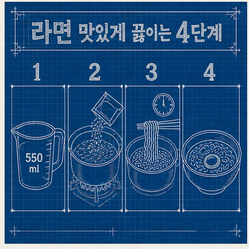
52. 청사진
추천 용도 워크숍, 창작, 아카이브
시각 문법 파란 바탕, 흰 설계선, 치수와 부품 라벨
제공된 소스를 분석하여 하나의 완결된 인포그래픽으로 구성해줘. 전체 내용을 청사진 스타일로 표현하고, 파란 바탕, 흰 설계선, 치수와 부품 라벨을 핵심 시각 문법으로 사용해. 중앙 또는 첫 구역에 명확한 제목을 배치하고, 핵심 정보를 4~6개 구역으로 나눠 번호·아이콘·화살표·연결선으로 읽는 순서를 보여줘. 각 구역은 짧은 제목과 1~2문장의 설명만 사용하며, 중요한 수치와 결론은 크게 강조해. 장식보다 정보 관계와 한글 가독성을 우선하고, 제공된 소스에 없는 사실은 추가하지 마. 로고와 워터마크 없이 16:9 가로 화면으로 제작해.
Analyze the provided sources and turn them into one self-contained infographic in a 청사진 visual style. Use 파란 바탕, 흰 설계선, 치수와 부품 라벨 as the core visual language. Place a clear title in the center or opening section, divide the content into four to six information zones, and show the reading order with numbers, icons, arrows, and connector lines. Give each zone a short heading and only one or two concise sentences. Enlarge key figures and conclusions. Prioritize information relationships and legibility over decoration, add no facts unsupported by the sources, and create a 16:9 landscape composition with no logos or watermarks.
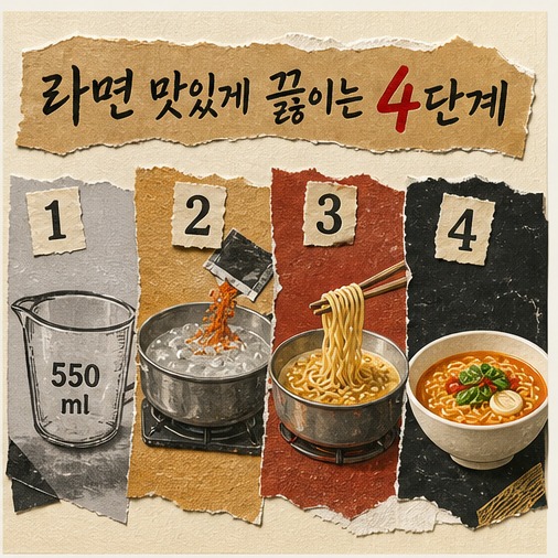
53. 크래프트 페이퍼
추천 용도 워크숍, 창작, 아카이브
시각 문법 갈색 종이, 검은 잉크, 스탬프, 실용적 라벨
제공된 소스를 분석하여 하나의 완결된 인포그래픽으로 구성해줘. 전체 내용을 크래프트 페이퍼 스타일로 표현하고, 갈색 종이, 검은 잉크, 스탬프, 실용적 라벨을 핵심 시각 문법으로 사용해. 중앙 또는 첫 구역에 명확한 제목을 배치하고, 핵심 정보를 4~6개 구역으로 나눠 번호·아이콘·화살표·연결선으로 읽는 순서를 보여줘. 각 구역은 짧은 제목과 1~2문장의 설명만 사용하며, 중요한 수치와 결론은 크게 강조해. 장식보다 정보 관계와 한글 가독성을 우선하고, 제공된 소스에 없는 사실은 추가하지 마. 로고와 워터마크 없이 16:9 가로 화면으로 제작해.
Analyze the provided sources and turn them into one self-contained infographic in a 크래프트 페이퍼 visual style. Use 갈색 종이, 검은 잉크, 스탬프, 실용적 라벨 as the core visual language. Place a clear title in the center or opening section, divide the content into four to six information zones, and show the reading order with numbers, icons, arrows, and connector lines. Give each zone a short heading and only one or two concise sentences. Enlarge key figures and conclusions. Prioritize information relationships and legibility over decoration, add no facts unsupported by the sources, and create a 16:9 landscape composition with no logos or watermarks.
54. 레터프레스
추천 용도 워크숍, 창작, 아카이브
시각 문법 두꺼운 종이, 눌린 활자, 2색 잉크, 미세 번짐
제공된 소스를 분석하여 하나의 완결된 인포그래픽으로 구성해줘. 전체 내용을 레터프레스 스타일로 표현하고, 두꺼운 종이, 눌린 활자, 2색 잉크, 미세 번짐을 핵심 시각 문법으로 사용해. 중앙 또는 첫 구역에 명확한 제목을 배치하고, 핵심 정보를 4~6개 구역으로 나눠 번호·아이콘·화살표·연결선으로 읽는 순서를 보여줘. 각 구역은 짧은 제목과 1~2문장의 설명만 사용하며, 중요한 수치와 결론은 크게 강조해. 장식보다 정보 관계와 한글 가독성을 우선하고, 제공된 소스에 없는 사실은 추가하지 마. 로고와 워터마크 없이 16:9 가로 화면으로 제작해.
Analyze the provided sources and turn them into one self-contained infographic in a 레터프레스 visual style. Use 두꺼운 종이, 눌린 활자, 2색 잉크, 미세 번짐 as the core visual language. Place a clear title in the center or opening section, divide the content into four to six information zones, and show the reading order with numbers, icons, arrows, and connector lines. Give each zone a short heading and only one or two concise sentences. Enlarge key figures and conclusions. Prioritize information relationships and legibility over decoration, add no facts unsupported by the sources, and create a 16:9 landscape composition with no logos or watermarks.
10. 리얼·아트형
푸드 포토 에디토리얼 · 수채화 · 과슈 일러스트 · 빈티지 푸드 도감 · 시네마틱 3D · 럭셔리 미니멀
55. 푸드 포토 에디토리얼
추천 용도 음식, 문화, 프리미엄 콘텐츠
시각 문법 사실적인 음식 사진, 자연광, 단계별 오버헤드 컷
제공된 소스를 분석하여 하나의 완결된 인포그래픽으로 구성해줘. 전체 내용을 푸드 포토 에디토리얼 스타일로 표현하고, 사실적인 음식 사진, 자연광, 단계별 오버헤드 컷을 핵심 시각 문법으로 사용해. 중앙 또는 첫 구역에 명확한 제목을 배치하고, 핵심 정보를 4~6개 구역으로 나눠 번호·아이콘·화살표·연결선으로 읽는 순서를 보여줘. 각 구역은 짧은 제목과 1~2문장의 설명만 사용하며, 중요한 수치와 결론은 크게 강조해. 장식보다 정보 관계와 한글 가독성을 우선하고, 제공된 소스에 없는 사실은 추가하지 마. 로고와 워터마크 없이 16:9 가로 화면으로 제작해.
Analyze the provided sources and turn them into one self-contained infographic in a 푸드 포토 에디토리얼 visual style. Use 사실적인 음식 사진, 자연광, 단계별 오버헤드 컷 as the core visual language. Place a clear title in the center or opening section, divide the content into four to six information zones, and show the reading order with numbers, icons, arrows, and connector lines. Give each zone a short heading and only one or two concise sentences. Enlarge key figures and conclusions. Prioritize information relationships and legibility over decoration, add no facts unsupported by the sources, and create a 16:9 landscape composition with no logos or watermarks.
56. 수채화
추천 용도 음식, 문화, 프리미엄 콘텐츠
시각 문법 투명한 색 번짐, 섬세한 음식 삽화, 여백
제공된 소스를 분석하여 하나의 완결된 인포그래픽으로 구성해줘. 전체 내용을 수채화 스타일로 표현하고, 투명한 색 번짐, 섬세한 음식 삽화, 여백을 핵심 시각 문법으로 사용해. 중앙 또는 첫 구역에 명확한 제목을 배치하고, 핵심 정보를 4~6개 구역으로 나눠 번호·아이콘·화살표·연결선으로 읽는 순서를 보여줘. 각 구역은 짧은 제목과 1~2문장의 설명만 사용하며, 중요한 수치와 결론은 크게 강조해. 장식보다 정보 관계와 한글 가독성을 우선하고, 제공된 소스에 없는 사실은 추가하지 마. 로고와 워터마크 없이 16:9 가로 화면으로 제작해.
Analyze the provided sources and turn them into one self-contained infographic in a 수채화 visual style. Use 투명한 색 번짐, 섬세한 음식 삽화, 여백 as the core visual language. Place a clear title in the center or opening section, divide the content into four to six information zones, and show the reading order with numbers, icons, arrows, and connector lines. Give each zone a short heading and only one or two concise sentences. Enlarge key figures and conclusions. Prioritize information relationships and legibility over decoration, add no facts unsupported by the sources, and create a 16:9 landscape composition with no logos or watermarks.
57. 과슈 일러스트
추천 용도 음식, 문화, 프리미엄 콘텐츠
시각 문법 불투명한 붓 터치, 따뜻한 색, 포스터형 그림
제공된 소스를 분석하여 하나의 완결된 인포그래픽으로 구성해줘. 전체 내용을 과슈 일러스트 스타일로 표현하고, 불투명한 붓 터치, 따뜻한 색, 포스터형 그림을 핵심 시각 문법으로 사용해. 중앙 또는 첫 구역에 명확한 제목을 배치하고, 핵심 정보를 4~6개 구역으로 나눠 번호·아이콘·화살표·연결선으로 읽는 순서를 보여줘. 각 구역은 짧은 제목과 1~2문장의 설명만 사용하며, 중요한 수치와 결론은 크게 강조해. 장식보다 정보 관계와 한글 가독성을 우선하고, 제공된 소스에 없는 사실은 추가하지 마. 로고와 워터마크 없이 16:9 가로 화면으로 제작해.
Analyze the provided sources and turn them into one self-contained infographic in a 과슈 일러스트 visual style. Use 불투명한 붓 터치, 따뜻한 색, 포스터형 그림 as the core visual language. Place a clear title in the center or opening section, divide the content into four to six information zones, and show the reading order with numbers, icons, arrows, and connector lines. Give each zone a short heading and only one or two concise sentences. Enlarge key figures and conclusions. Prioritize information relationships and legibility over decoration, add no facts unsupported by the sources, and create a 16:9 landscape composition with no logos or watermarks.
58. 빈티지 푸드 도감
추천 용도 음식, 문화, 프리미엄 콘텐츠
시각 문법 식재료 세밀화, 번호 라벨, 오래된 백과사전
제공된 소스를 분석하여 하나의 완결된 인포그래픽으로 구성해줘. 전체 내용을 빈티지 푸드 도감 스타일로 표현하고, 식재료 세밀화, 번호 라벨, 오래된 백과사전을 핵심 시각 문법으로 사용해. 중앙 또는 첫 구역에 명확한 제목을 배치하고, 핵심 정보를 4~6개 구역으로 나눠 번호·아이콘·화살표·연결선으로 읽는 순서를 보여줘. 각 구역은 짧은 제목과 1~2문장의 설명만 사용하며, 중요한 수치와 결론은 크게 강조해. 장식보다 정보 관계와 한글 가독성을 우선하고, 제공된 소스에 없는 사실은 추가하지 마. 로고와 워터마크 없이 16:9 가로 화면으로 제작해.
Analyze the provided sources and turn them into one self-contained infographic in a 빈티지 푸드 도감 visual style. Use 식재료 세밀화, 번호 라벨, 오래된 백과사전 as the core visual language. Place a clear title in the center or opening section, divide the content into four to six information zones, and show the reading order with numbers, icons, arrows, and connector lines. Give each zone a short heading and only one or two concise sentences. Enlarge key figures and conclusions. Prioritize information relationships and legibility over decoration, add no facts unsupported by the sources, and create a 16:9 landscape composition with no logos or watermarks.
59. 시네마틱 3D
추천 용도 음식, 문화, 프리미엄 콘텐츠
시각 문법 극적인 조명, 사실적 증기, 단계별 장면
제공된 소스를 분석하여 하나의 완결된 인포그래픽으로 구성해줘. 전체 내용을 시네마틱 3D 스타일로 표현하고, 극적인 조명, 사실적 증기, 단계별 장면을 핵심 시각 문법으로 사용해. 중앙 또는 첫 구역에 명확한 제목을 배치하고, 핵심 정보를 4~6개 구역으로 나눠 번호·아이콘·화살표·연결선으로 읽는 순서를 보여줘. 각 구역은 짧은 제목과 1~2문장의 설명만 사용하며, 중요한 수치와 결론은 크게 강조해. 장식보다 정보 관계와 한글 가독성을 우선하고, 제공된 소스에 없는 사실은 추가하지 마. 로고와 워터마크 없이 16:9 가로 화면으로 제작해.
Analyze the provided sources and turn them into one self-contained infographic in a 시네마틱 3D visual style. Use 극적인 조명, 사실적 증기, 단계별 장면 as the core visual language. Place a clear title in the center or opening section, divide the content into four to six information zones, and show the reading order with numbers, icons, arrows, and connector lines. Give each zone a short heading and only one or two concise sentences. Enlarge key figures and conclusions. Prioritize information relationships and legibility over decoration, add no facts unsupported by the sources, and create a 16:9 landscape composition with no logos or watermarks.
60. 럭셔리 미니멀
추천 용도 음식, 문화, 프리미엄 콘텐츠
시각 문법 검정·크림·금색, 한 장면 중심, 절제된 라벨
제공된 소스를 분석하여 하나의 완결된 인포그래픽으로 구성해줘. 전체 내용을 럭셔리 미니멀 스타일로 표현하고, 검정·크림·금색, 한 장면 중심, 절제된 라벨을 핵심 시각 문법으로 사용해. 중앙 또는 첫 구역에 명확한 제목을 배치하고, 핵심 정보를 4~6개 구역으로 나눠 번호·아이콘·화살표·연결선으로 읽는 순서를 보여줘. 각 구역은 짧은 제목과 1~2문장의 설명만 사용하며, 중요한 수치와 결론은 크게 강조해. 장식보다 정보 관계와 한글 가독성을 우선하고, 제공된 소스에 없는 사실은 추가하지 마. 로고와 워터마크 없이 16:9 가로 화면으로 제작해.
Analyze the provided sources and turn them into one self-contained infographic in a 럭셔리 미니멀 visual style. Use 검정·크림·금색, 한 장면 중심, 절제된 라벨 as the core visual language. Place a clear title in the center or opening section, divide the content into four to six information zones, and show the reading order with numbers, icons, arrows, and connector lines. Give each zone a short heading and only one or two concise sentences. Enlarge key figures and conclusions. Prioritize information relationships and legibility over decoration, add no facts unsupported by the sources, and create a 16:9 landscape composition with no logos or watermarks.
스타일을 직접 조합하고 싶다면
위 60개 중 정보 구조(순서·과정형, 비교·선택형 등)와 시각 스타일(카와이, 스위스 모더니즘 등)을 하나씩 골라 아래 틀에 넣으면 새 조합을 만들 수 있습니다.
제공된 소스를 분석해 하나의 완결된 인포그래픽으로 구성해줘.
[정보 구조]를 기본 레이아웃으로 사용하고, [시각 스타일]의 표현 방식을 적용해.
핵심 정보를 4~6개 구역으로 나누고 번호·아이콘·화살표·연결선으로 읽는 순서와 정보 관계를 보여줘.
각 구역은 짧은 제목과 1~2문장의 설명만 사용하고, 중요한 수치와 결론은 크게 강조해.
[색상 팔레트]를 일관되게 사용하며 장식보다 정보 위계와 한글 가독성을 우선해.
제공된 소스에 없는 사실은 추가하지 말고, 로고와 워터마크 없이 16:9 가로 화면으로 제작해.
Analyze the provided sources and create one self-contained infographic.
Use [information structure] as the base layout and apply the visual language of [visual style].
Divide the key information into four to six zones, showing reading order and relationships with numbers, icons, arrows, and connector lines.
Use a short heading and only one or two concise sentences per zone, and enlarge important figures and conclusions.
Apply [color palette] consistently and prioritize hierarchy and legibility over decoration.
Do not add facts unsupported by the sources. Create a 16:9 landscape composition with no logos or watermarks.
조합 예시가로 타임라인 × 카와이 · 의사결정 트리 × 스위스 모더니즘 · 해부도 × 빈티지 푸드 도감 — "정보 구조"와 "시각 스타일"을 하나씩 선택하면 결과가 안정적입니다.